Abstract
Sports have a remarkable ability to unite communities, fostering a sense of belonging and camaraderie among residents. Whether it’s through local teams, community leagues, or major sporting events, the shared passion for sports brings people together, transcending age, ethnicity, and socioeconomic backgrounds. In addition to providing entertainment and recreation, sports serve as a common language that promotes interaction and collaboration. From cheering for hometown teams to participating in recreational activities, community members bond over their shared experiences, building friendships and support networks that strengthen the social fabric of the area. Through sports, communities not only celebrate athletic achievement but also cultivate a deeper sense of identity and pride, making the local area a vibrant and cohesive place to live.
Mission Statement
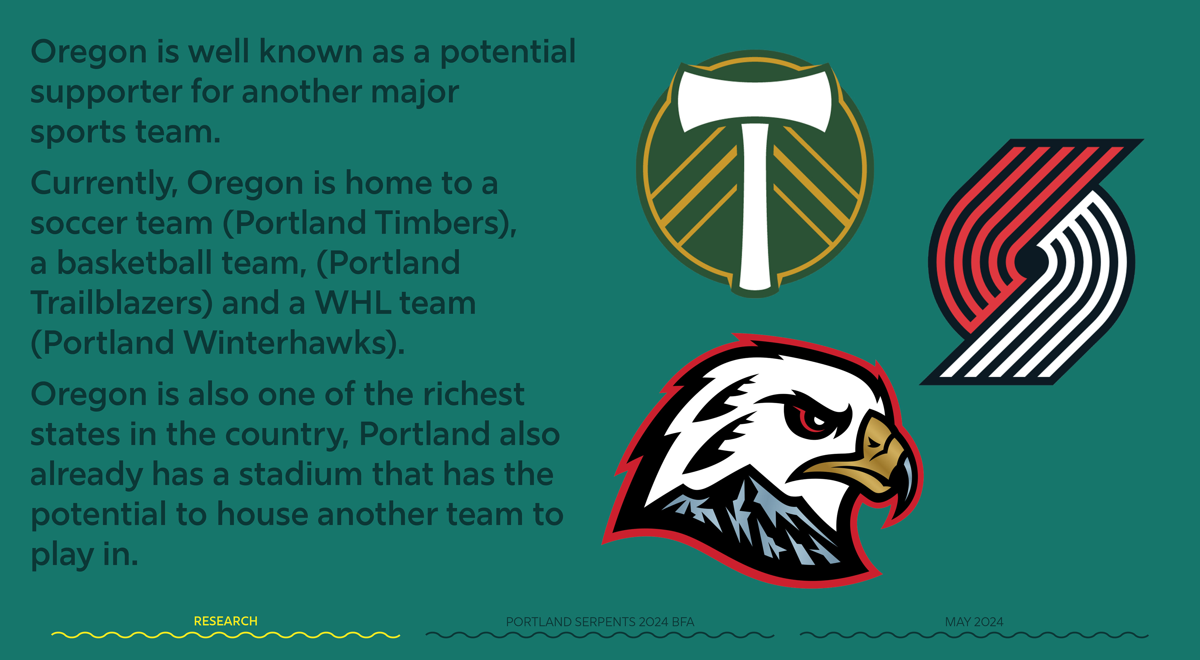
To create a speculative design for a hockey team and create a sense of community for the hockey fans in Portland, Oregon.
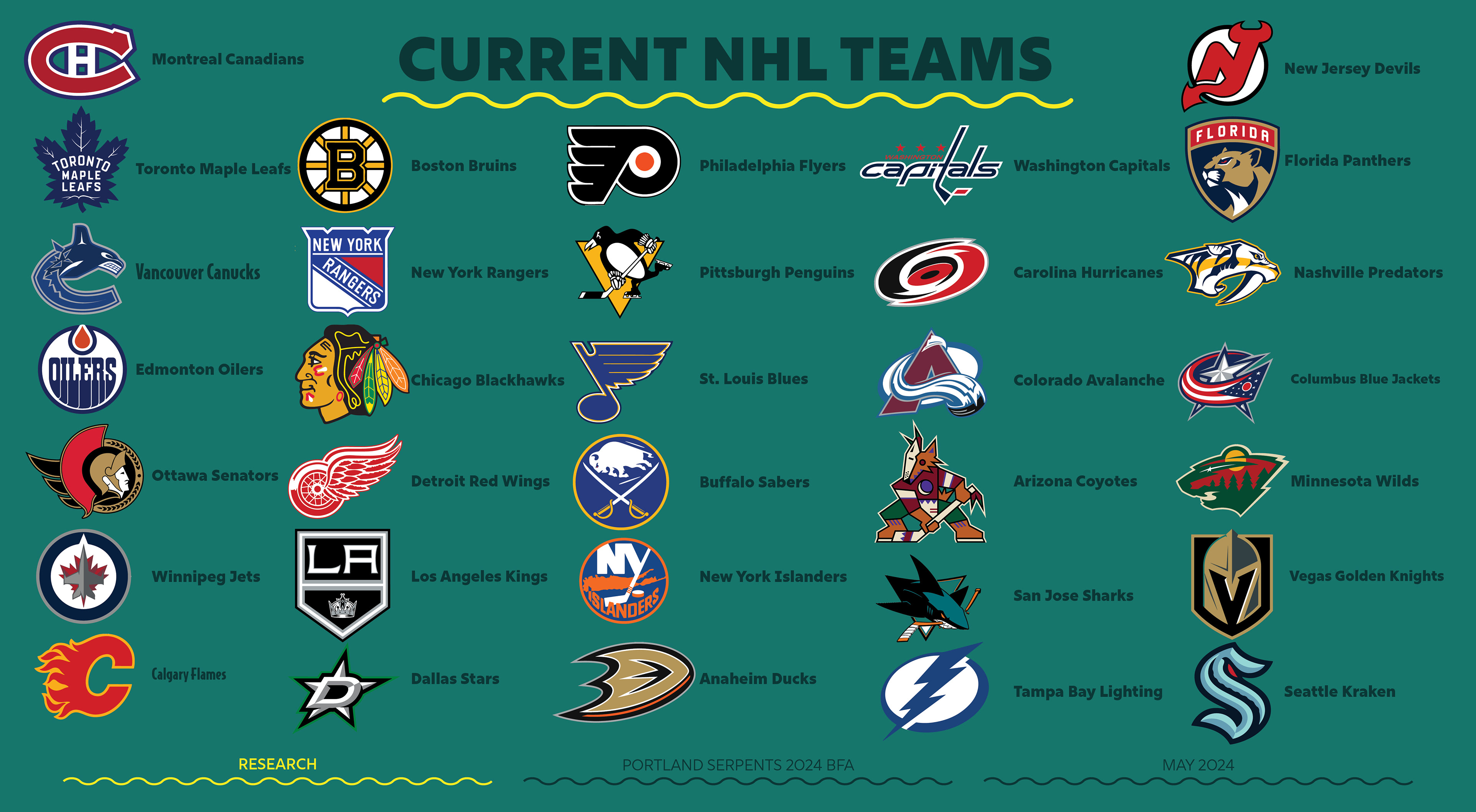
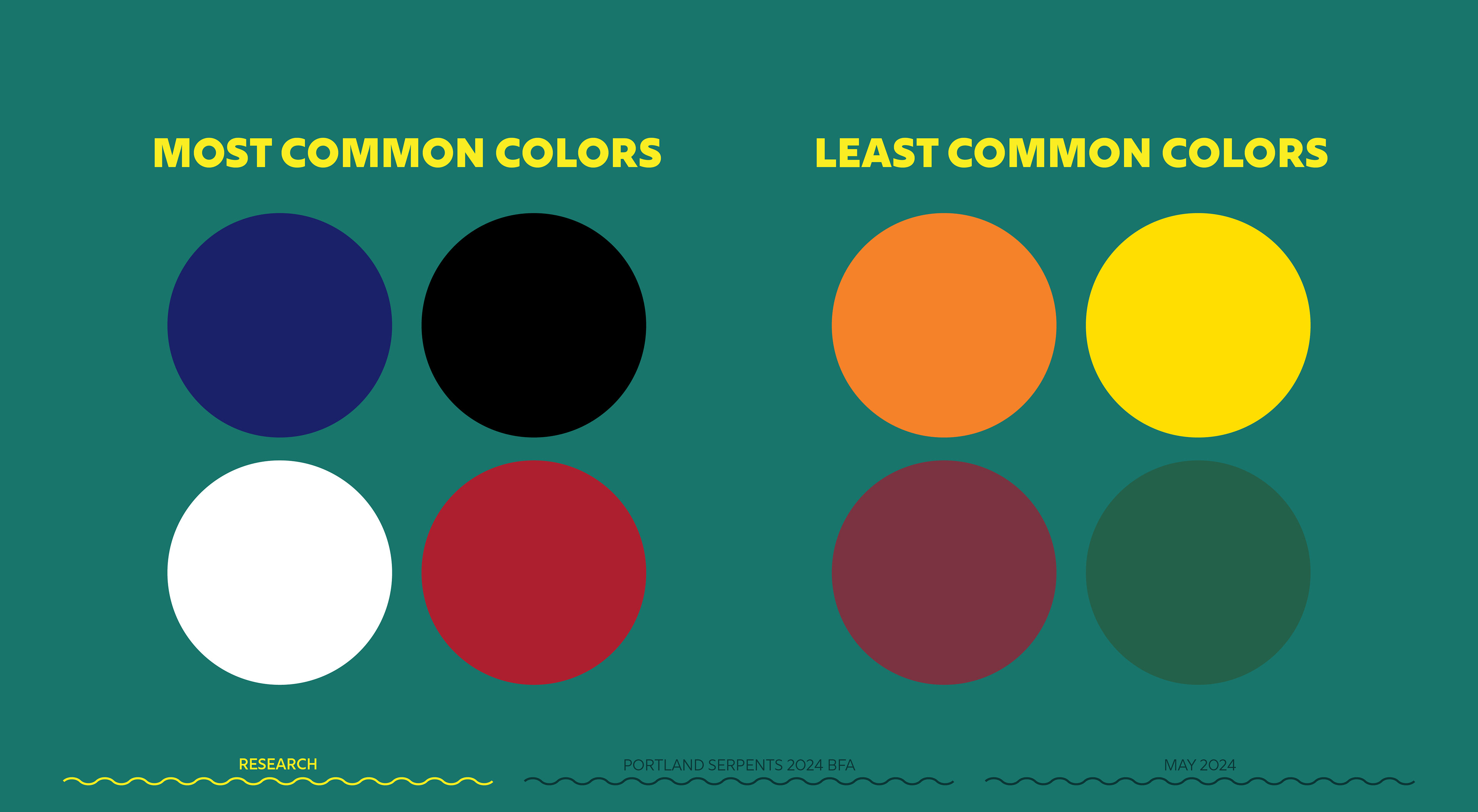
research

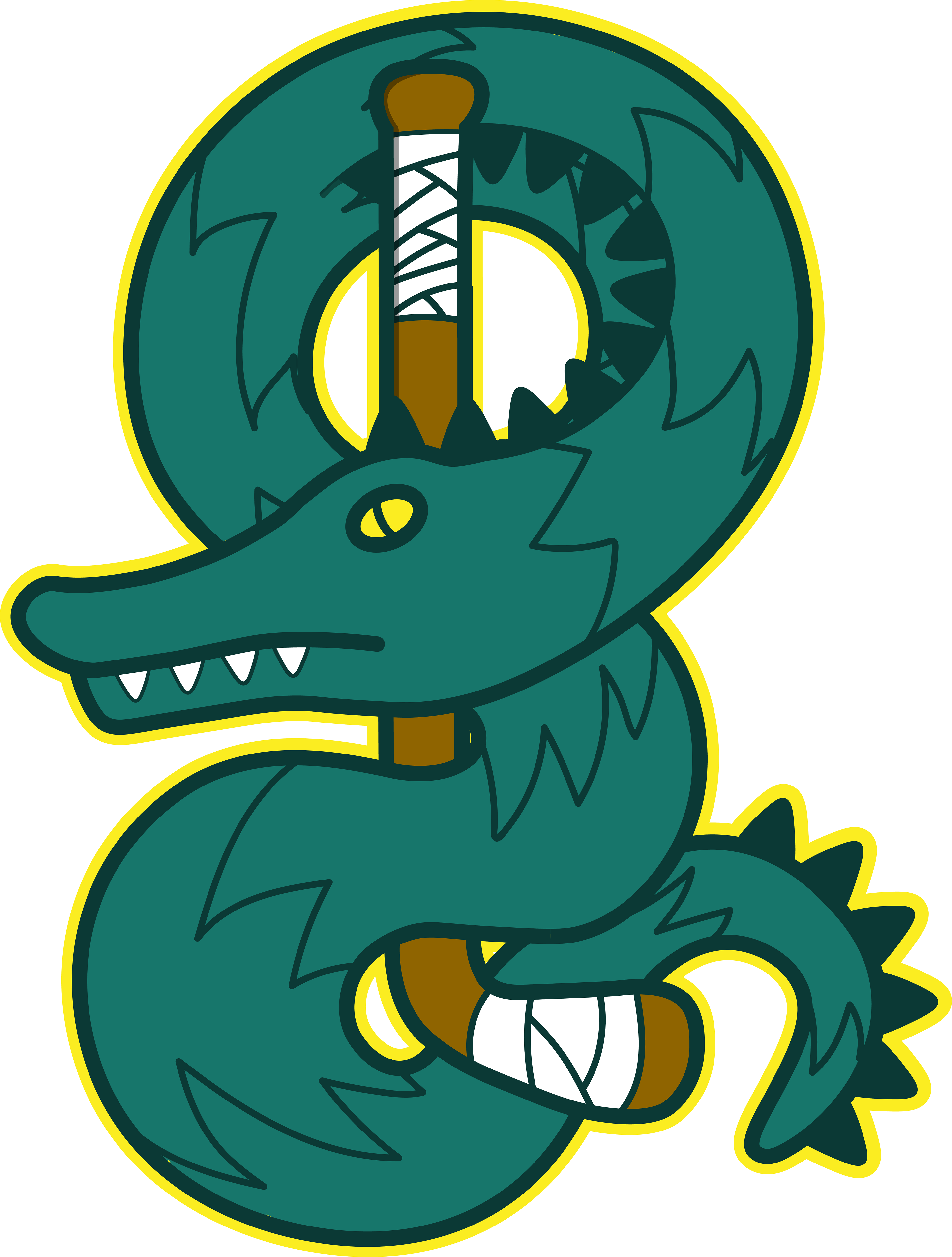
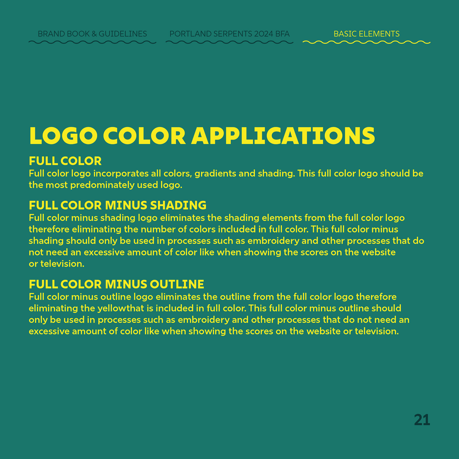
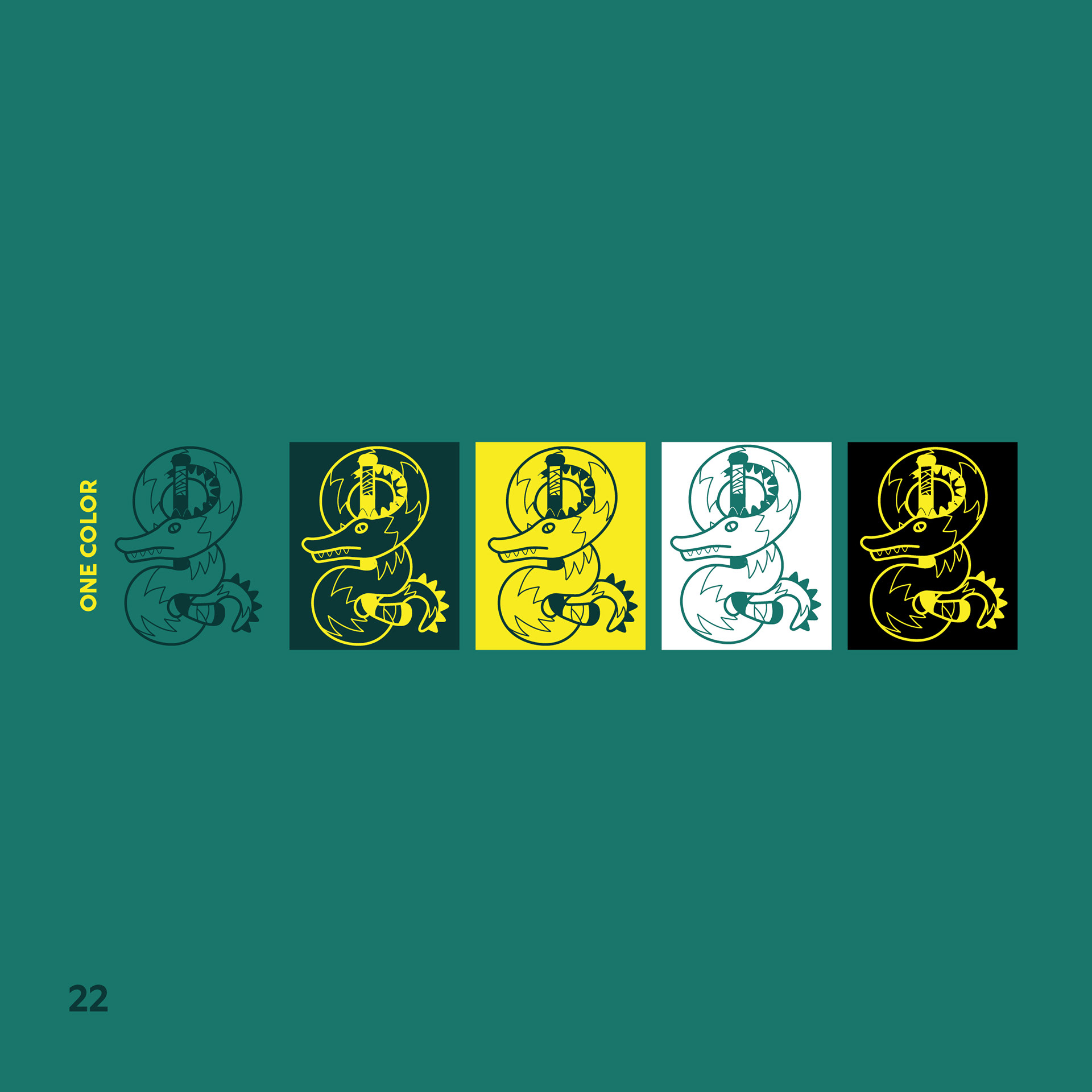
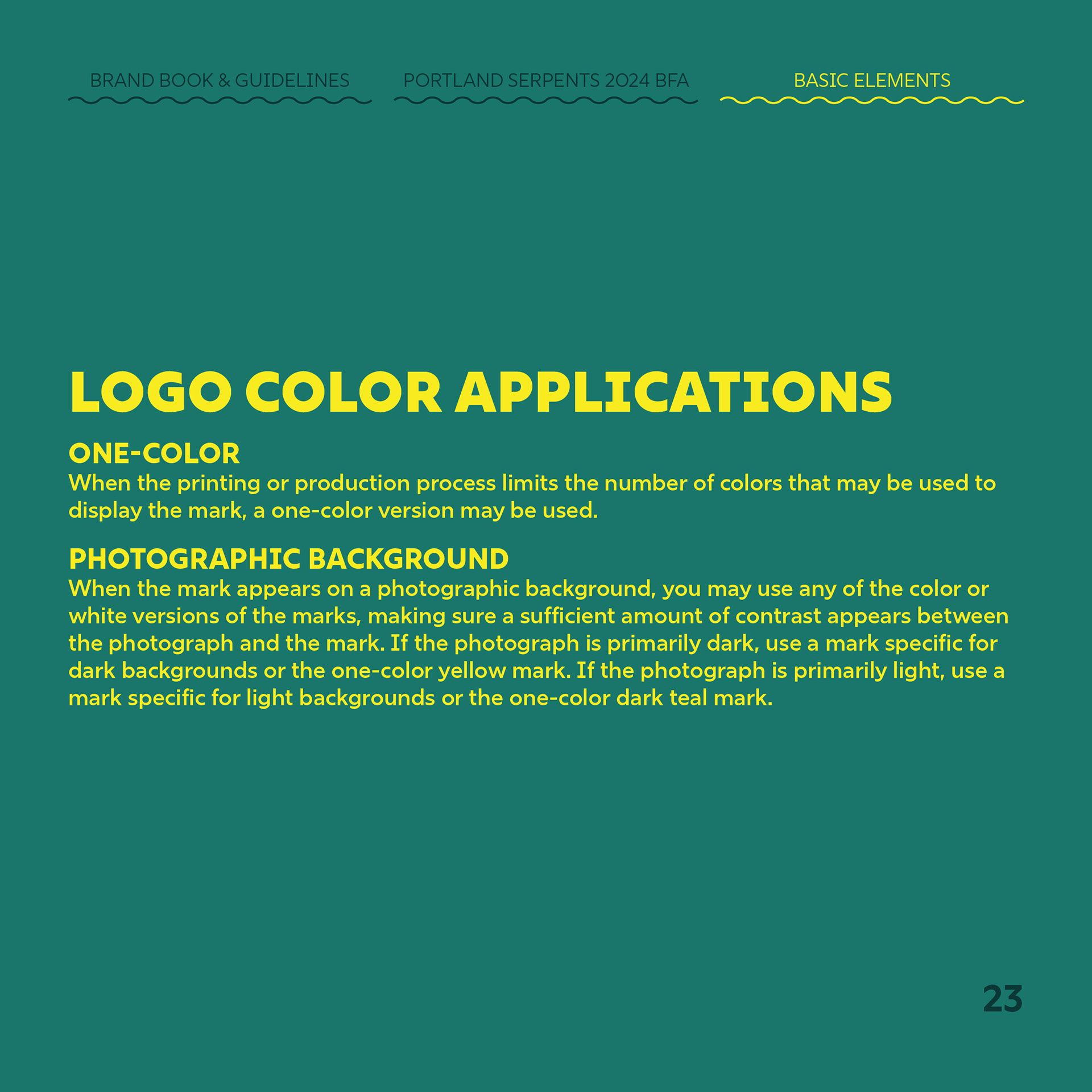
the logo
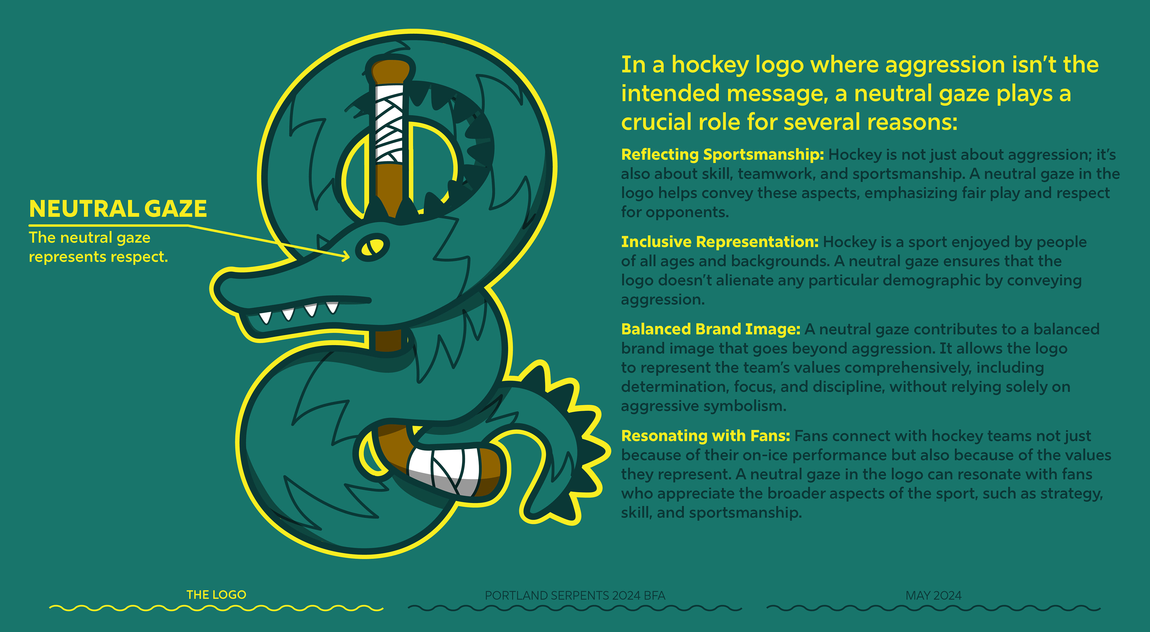
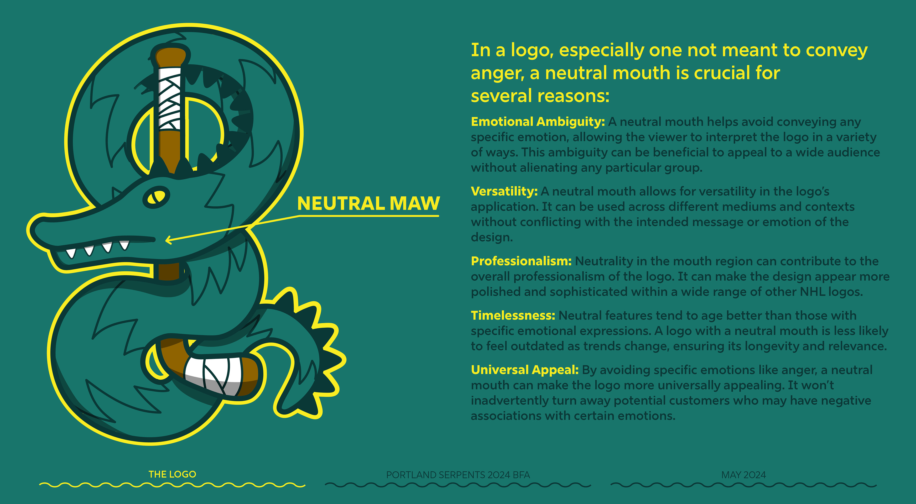
Neutrality Statement
Unlike logos designed to elicit specific emotions like anger or aggression, a neutral emblem aims to evoke emotions such as camaraderie, respect, and fairness. This neutrality allows the logo to symbolize the essence of sportsmanship and the universal love for the game. In an increasingly diverse and interconnected world, a neutral logo serves as a unifying force, fostering a sense of inclusivity and belonging among fans from different backgrounds.
A neutral emblem ensures that its message remains relevant and accessible to a broader audience, transcending cultural and regional divides. Thus, the importance of a neutral logo lies in its ability to evoke emotions of unity and mutual respect, embodying the core values of sportsmanship on a global scale.
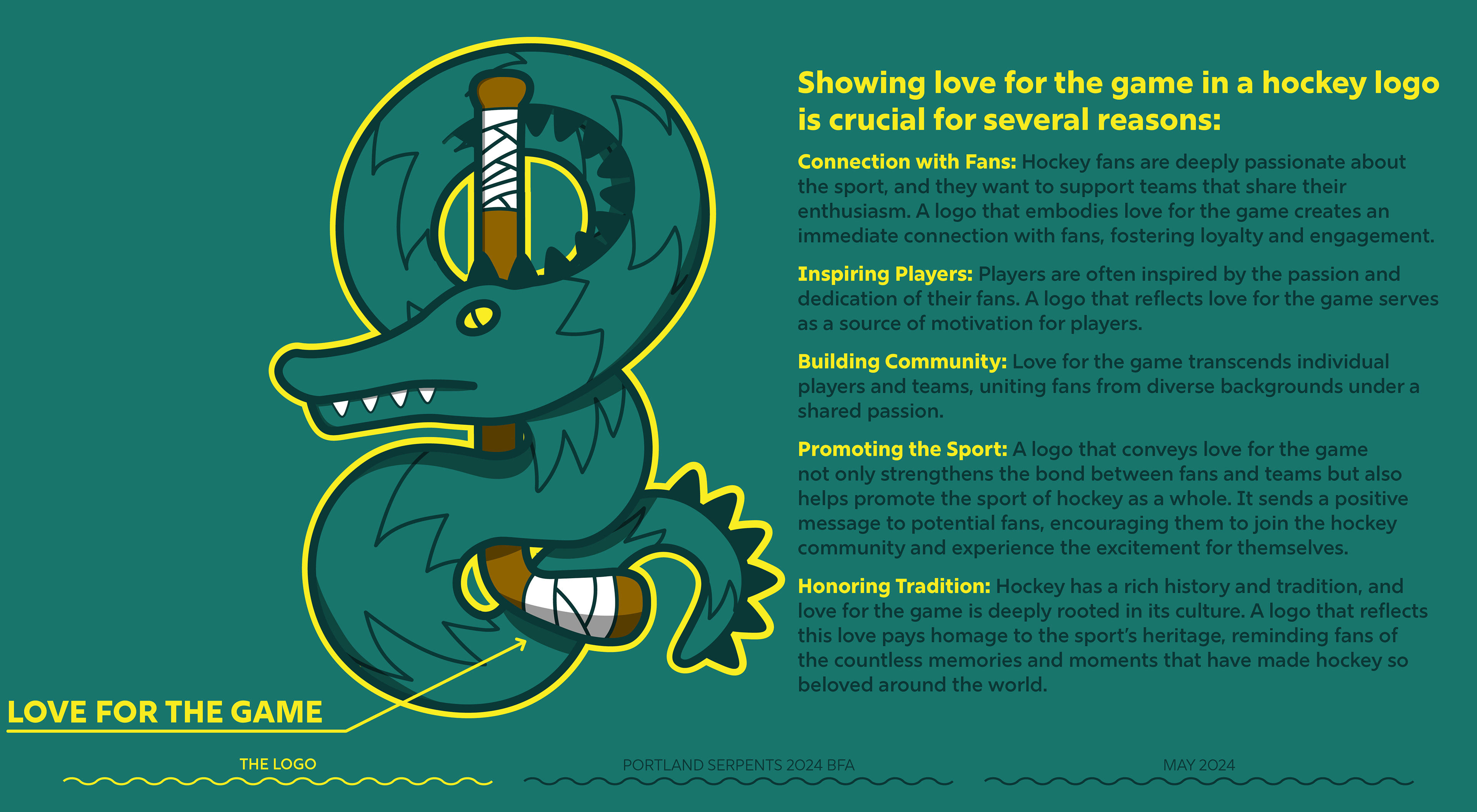
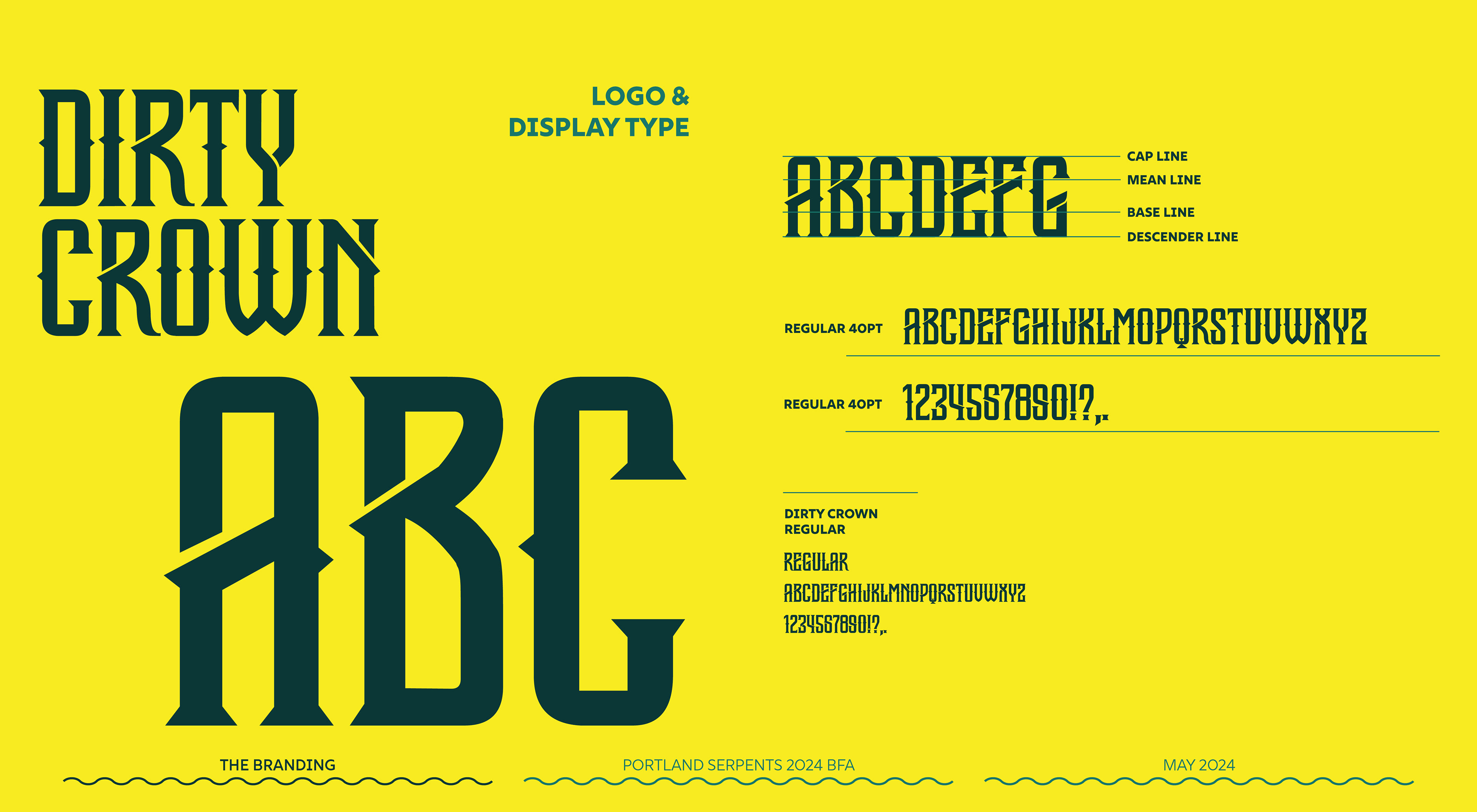
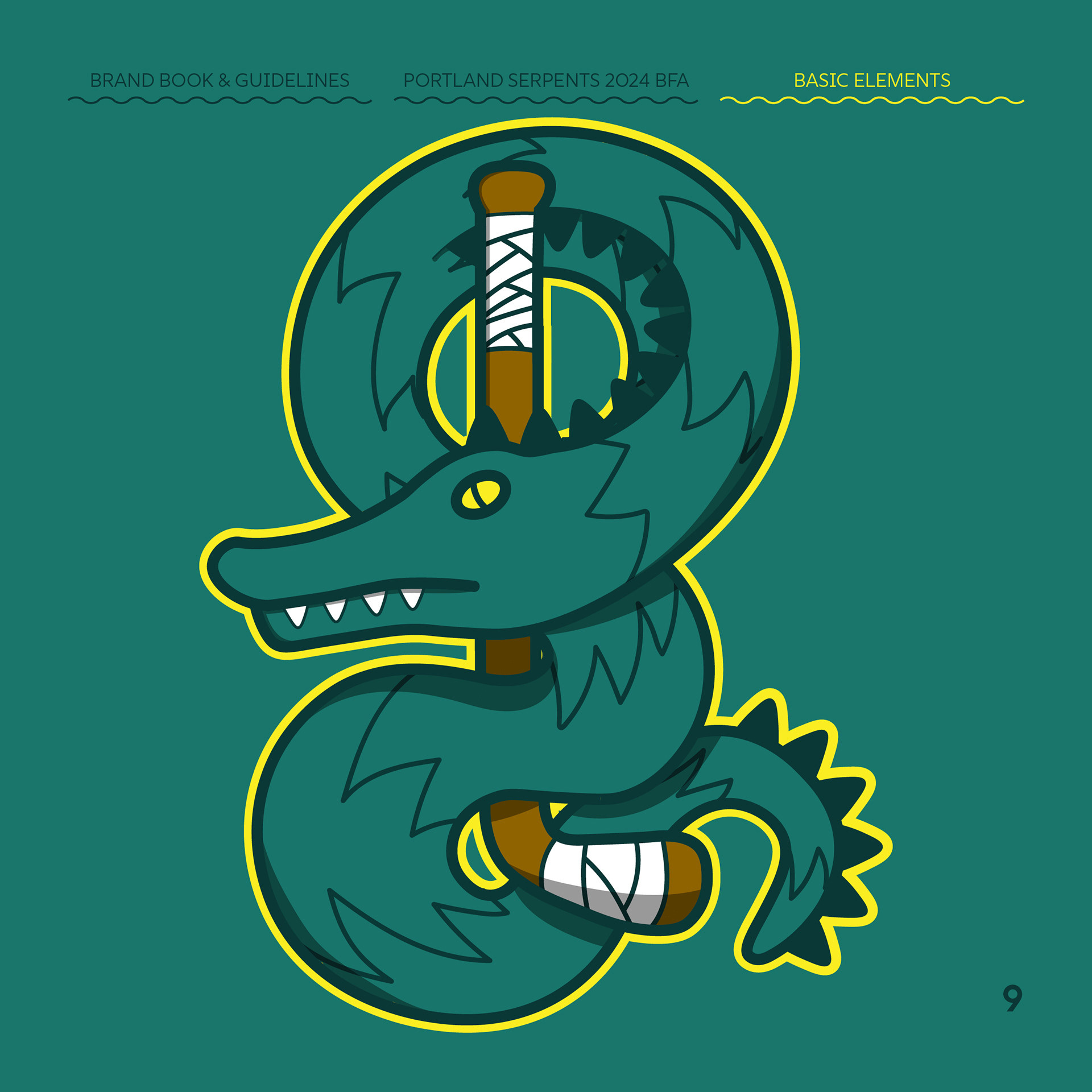
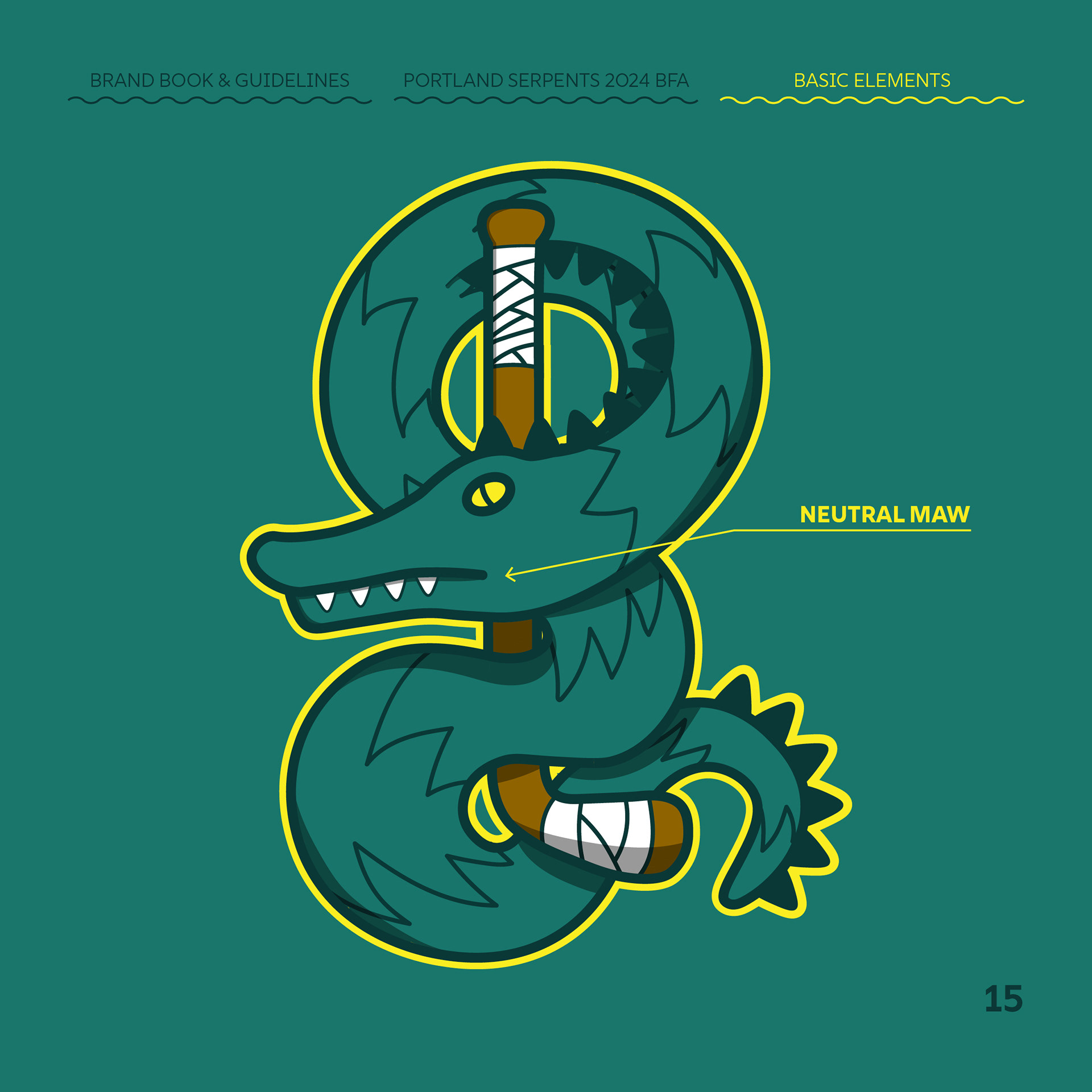
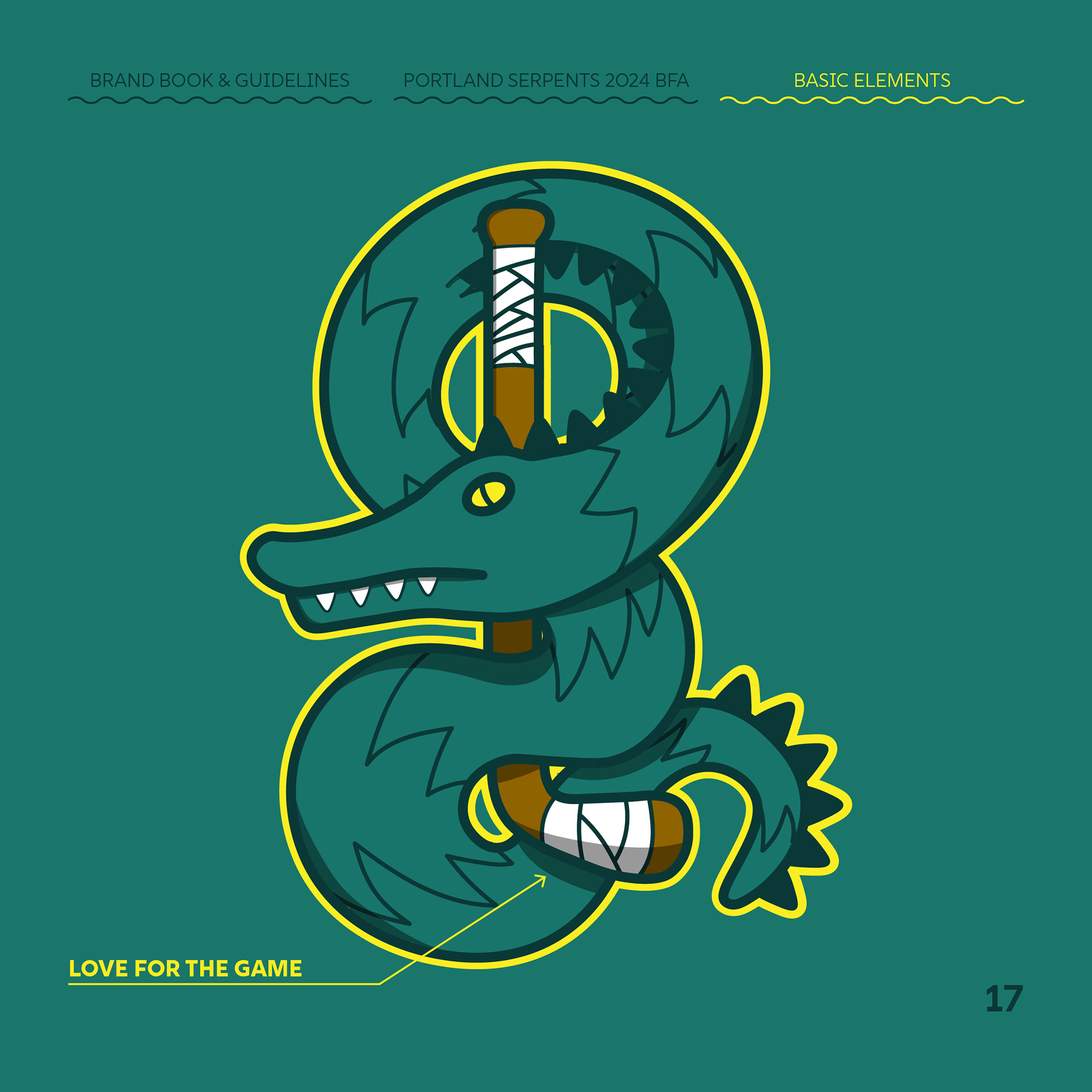
The logo is based on the Greek myth of the Rod of Arclepius. It is a symbol of physician's art as well as a dual meaning of healing and harm, perfect for a hockey logo. Oregon also has many nautical myths including one of Colossal Claude, a sea serpent who guarded the coast.
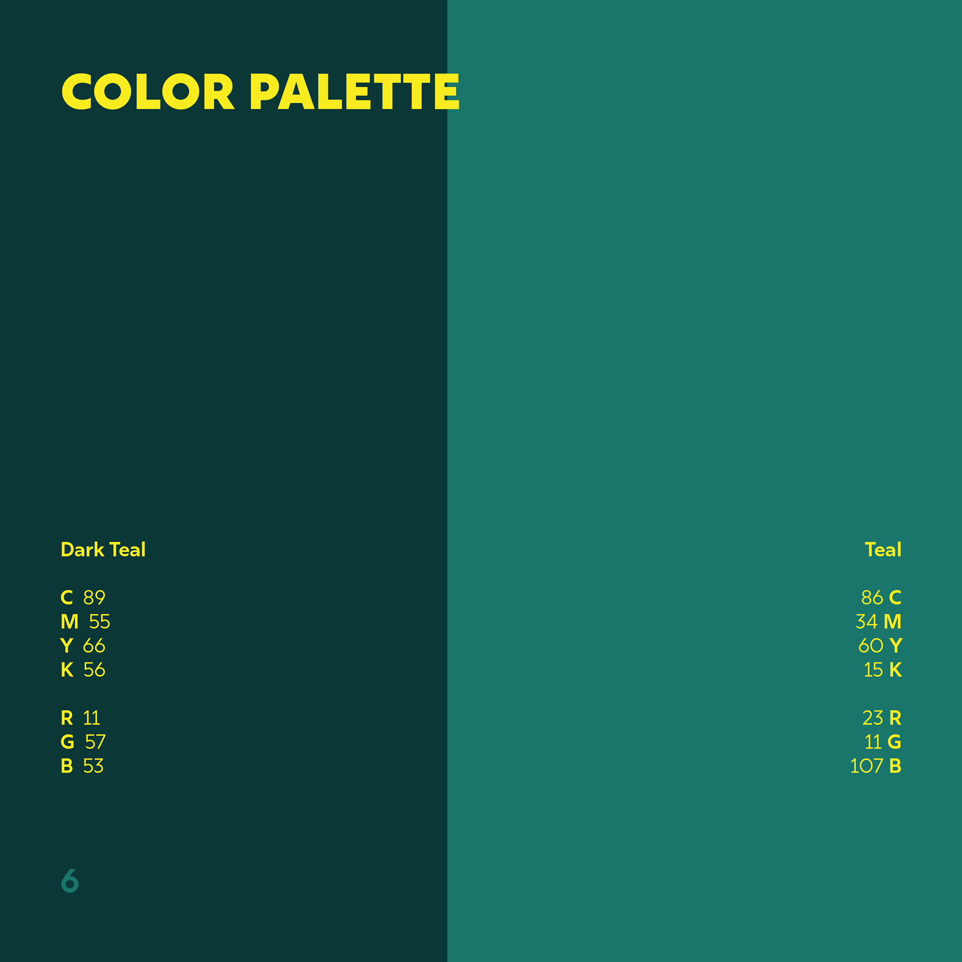
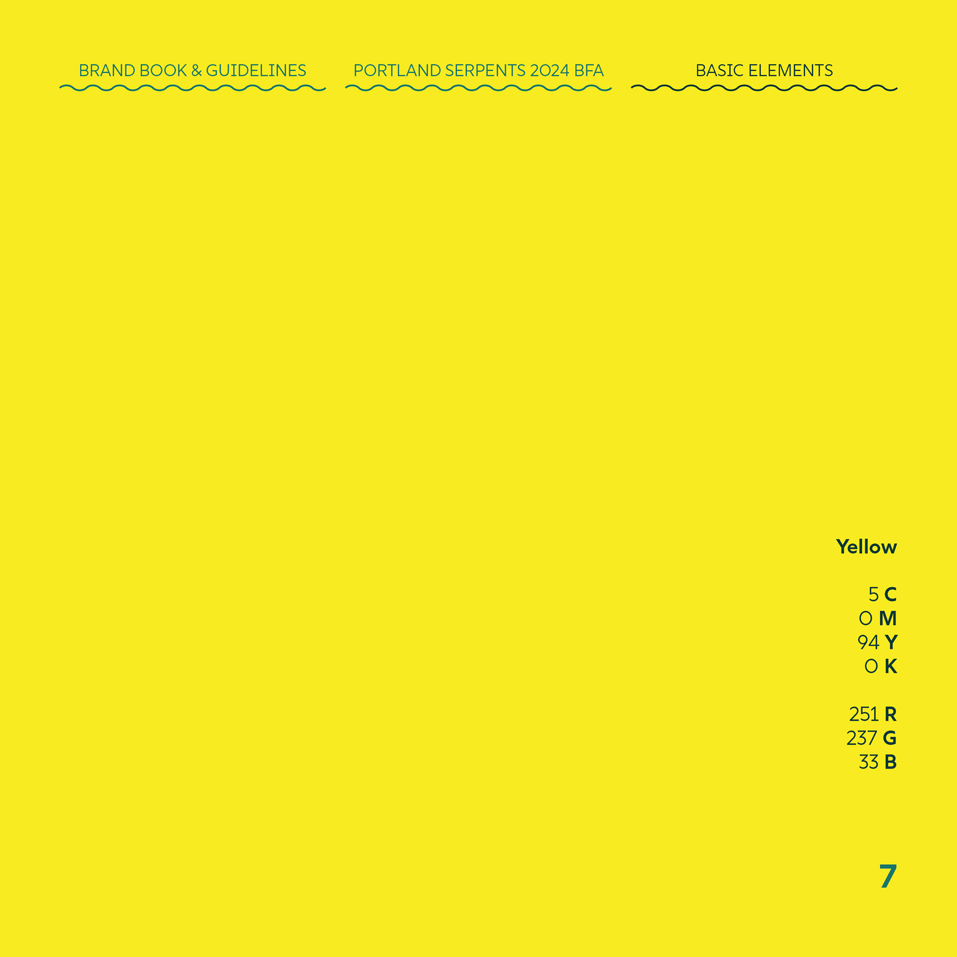
color palette
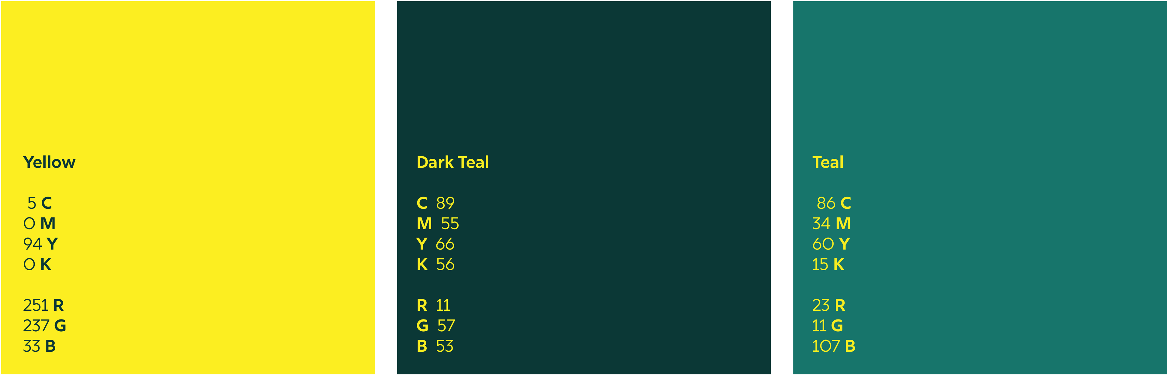
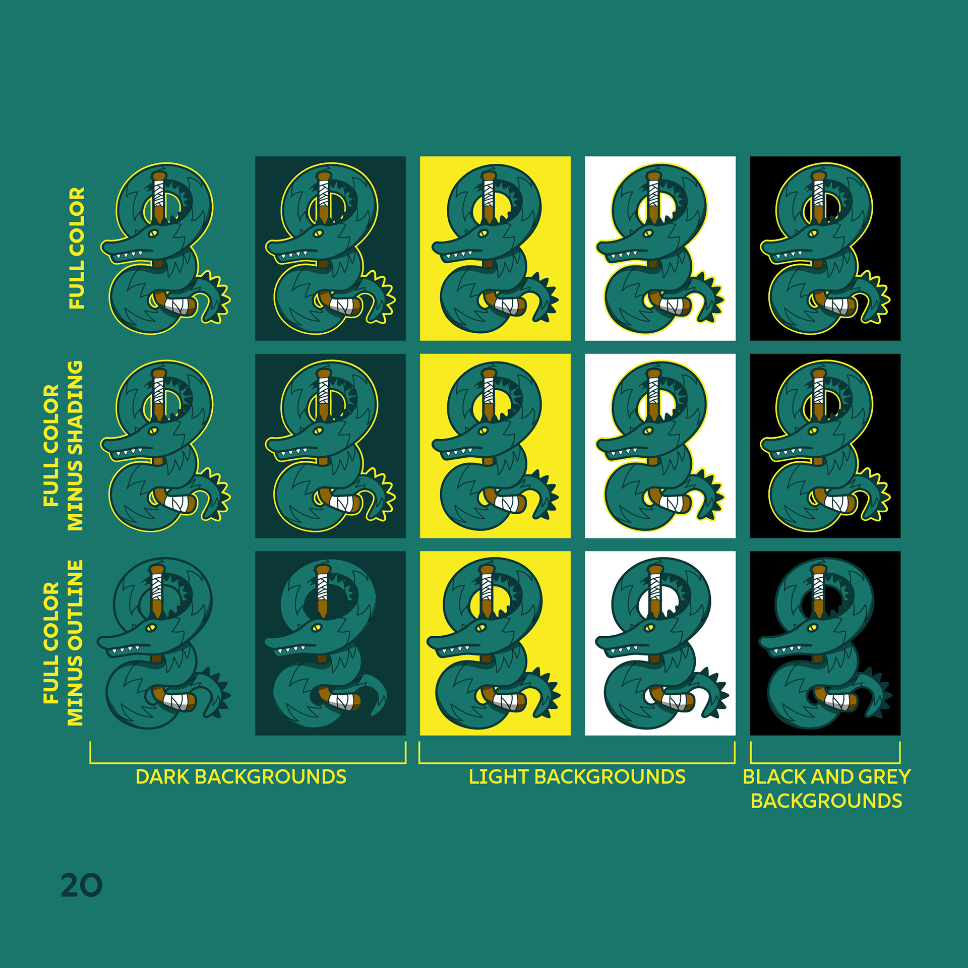
I wanted to keep the color palette very simple, 3 colors or less was my goal to keep the other deliverables as simple and cohesive as possible.
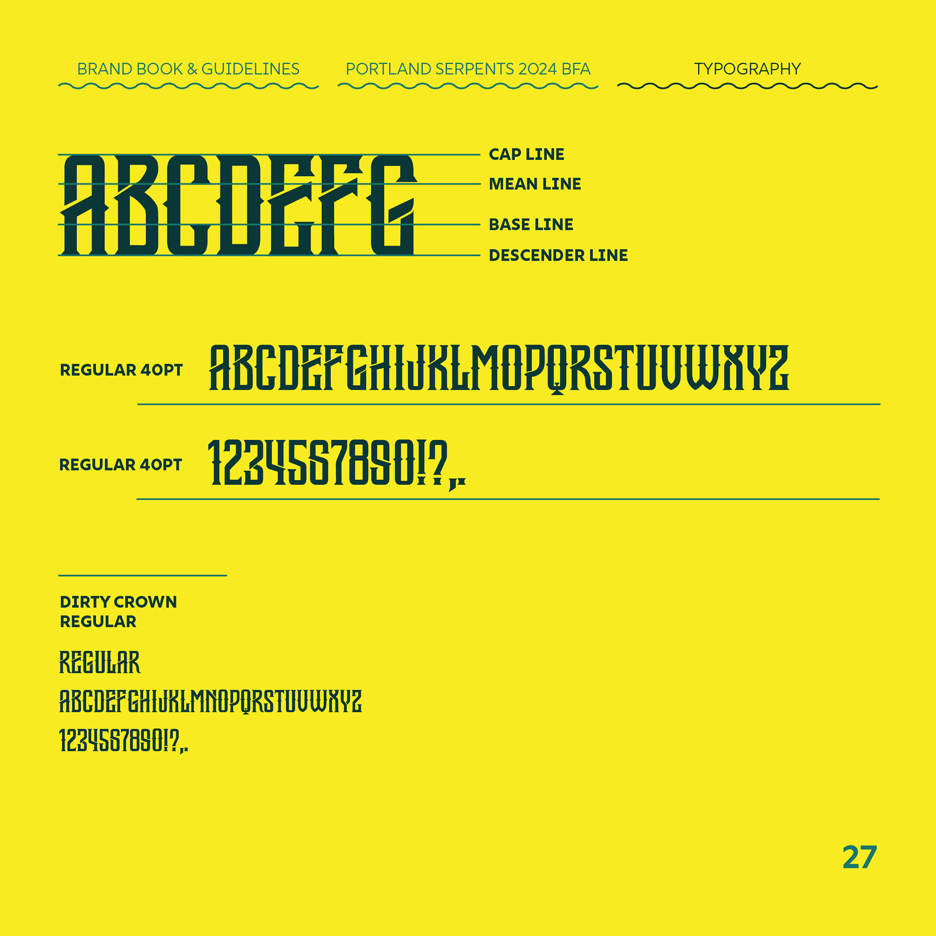
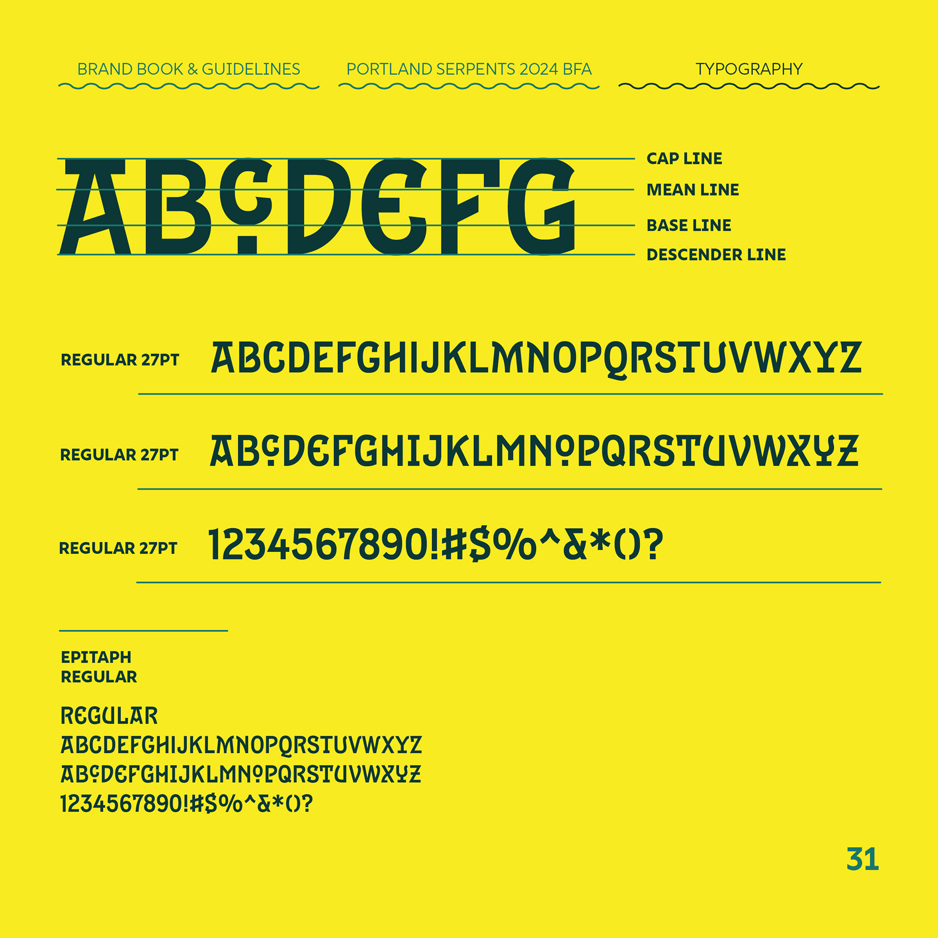
typography
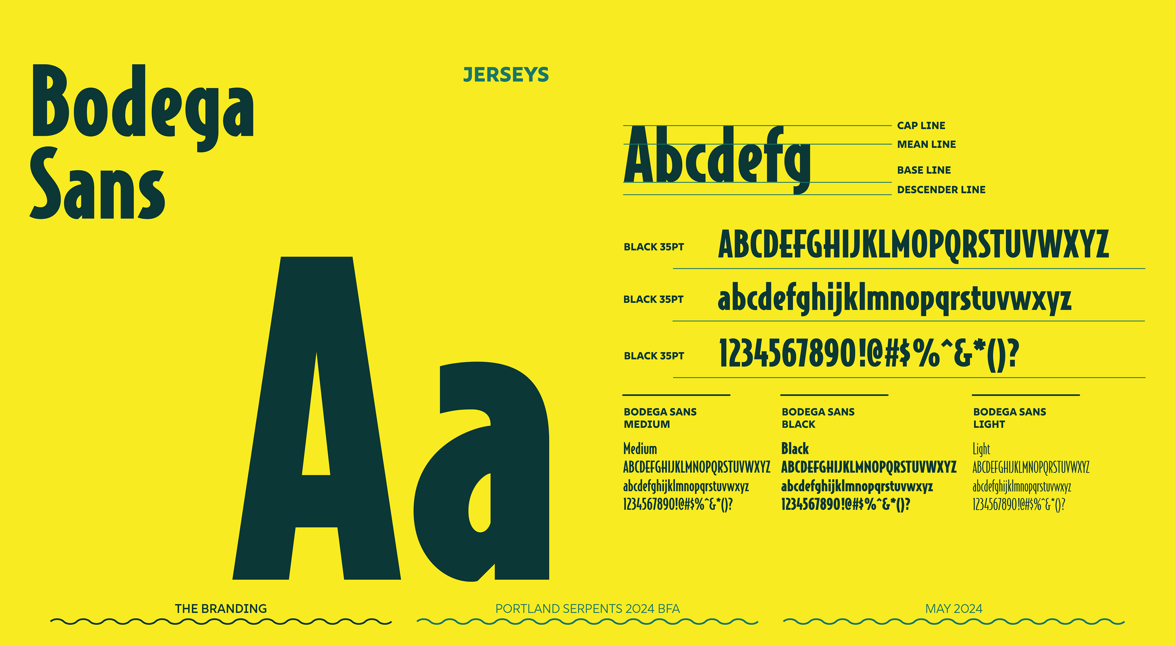
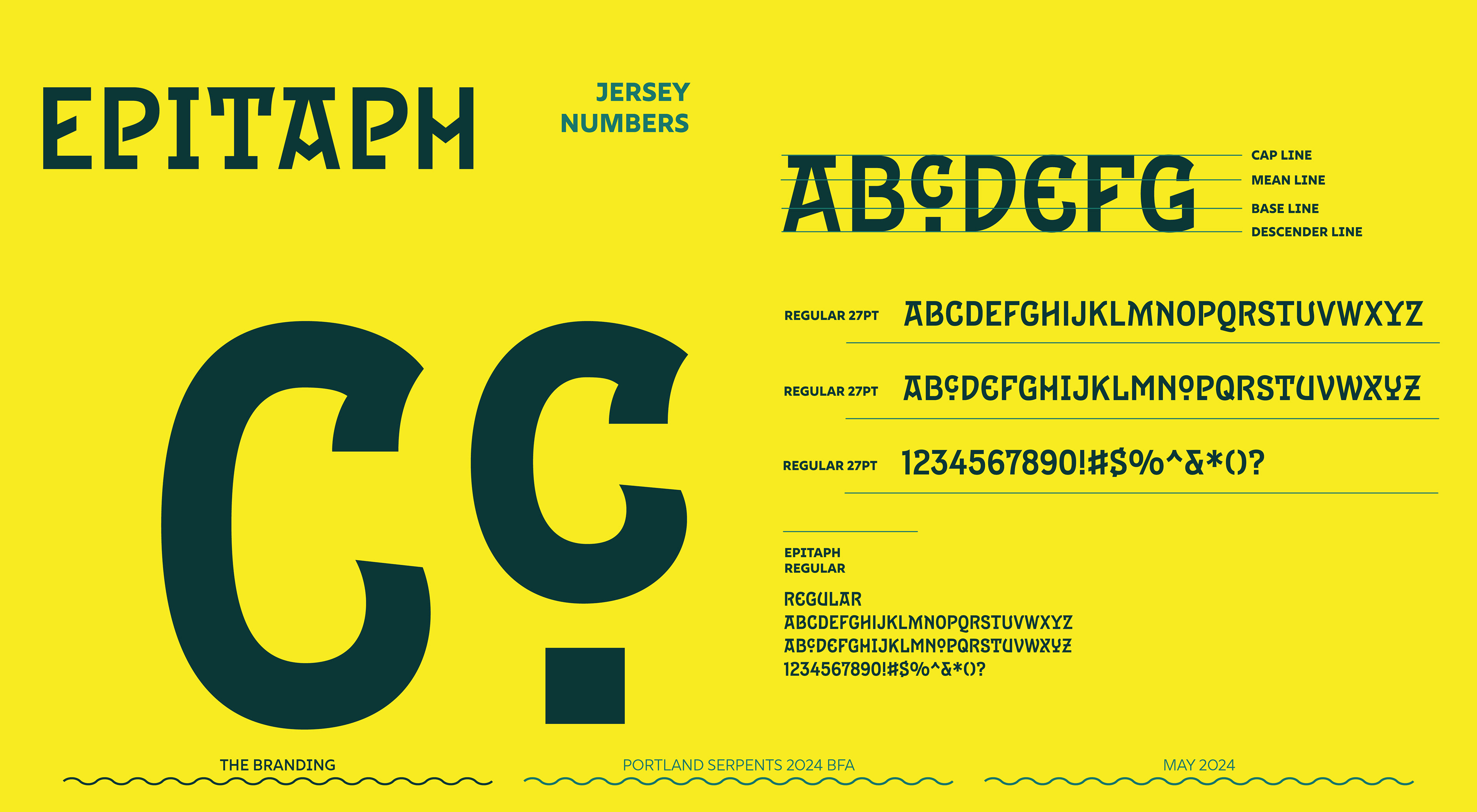

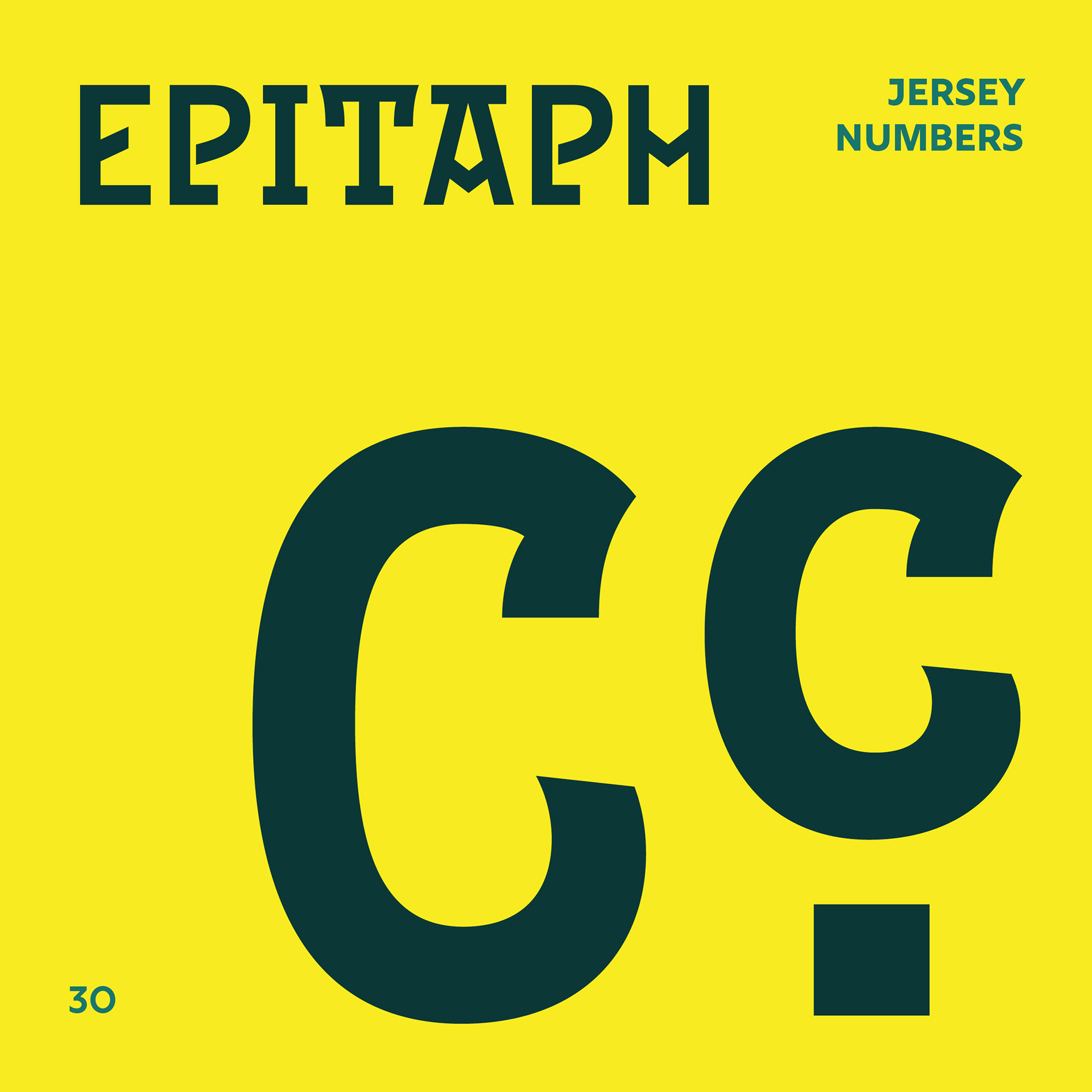
The jerseys
These jerseys were a labor of love. Since thinking up this project I always wanted to have this as something physical.
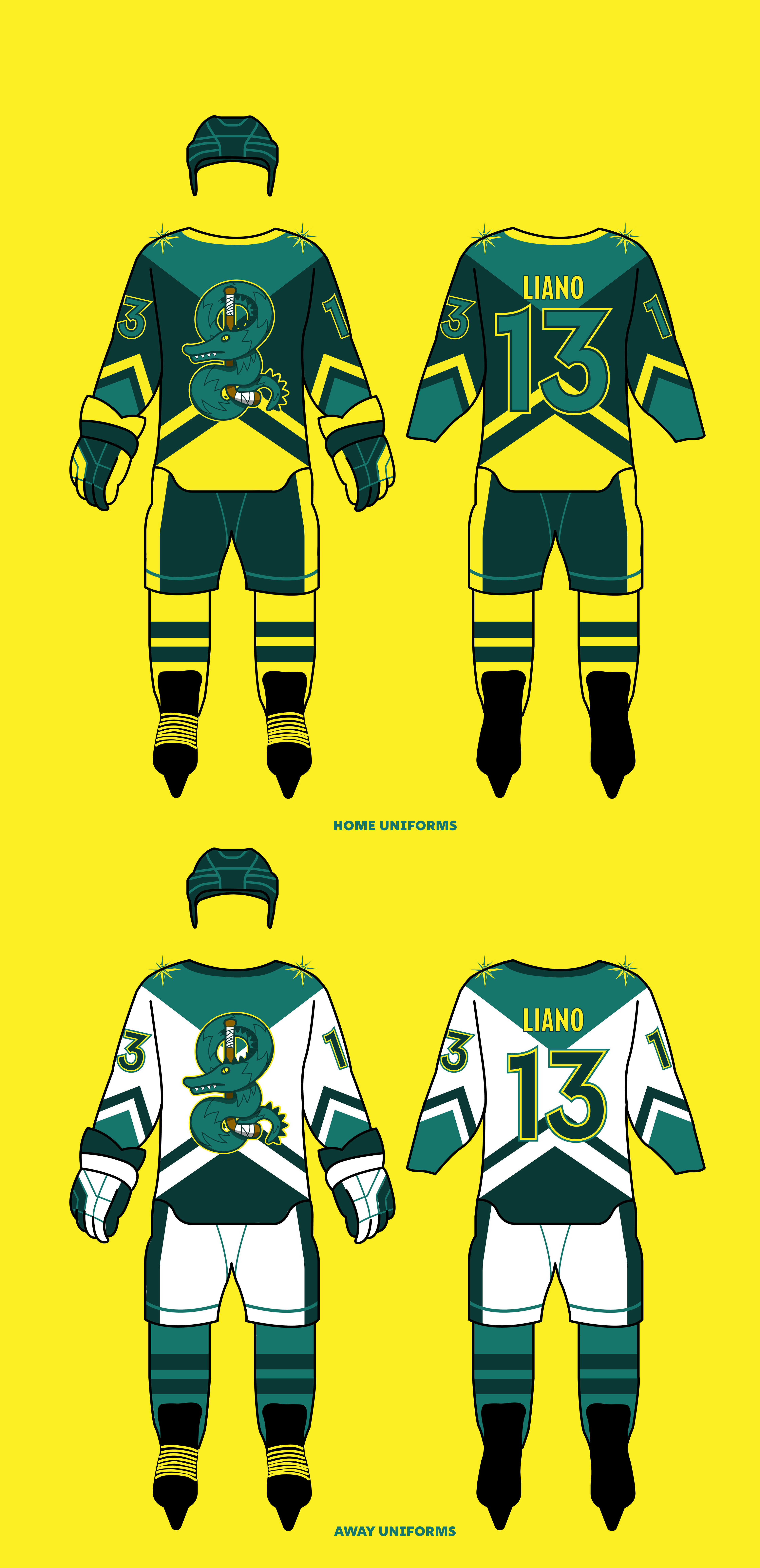

When I first started this project I knew I wanted a physical jersey to show off in my presentation as well as beyond the presentation. I went to a company that took the design that I gave them and put it perfectly onto customizable jerseys that could have different names and numbers.
Brand Book


mobile app
