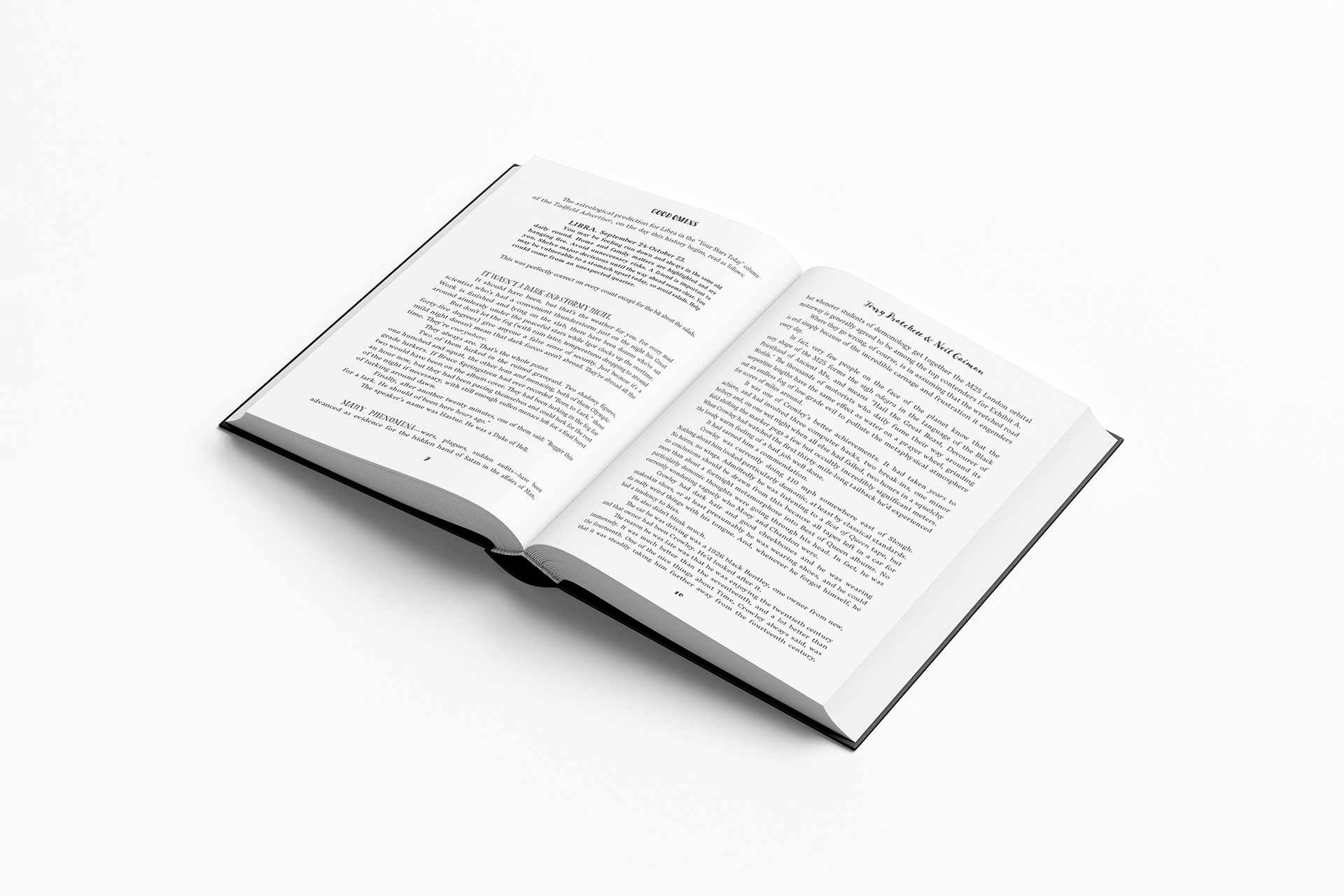
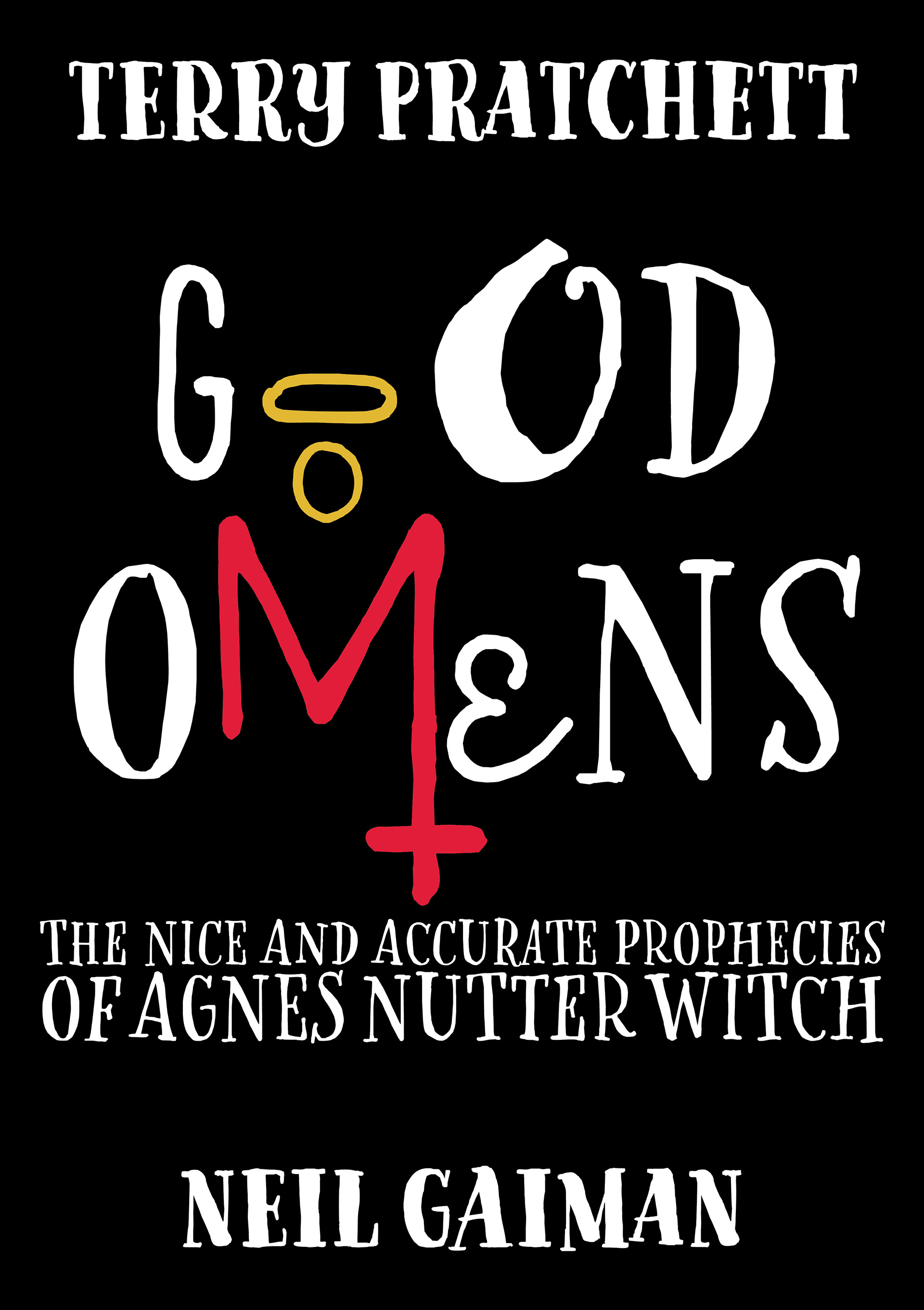
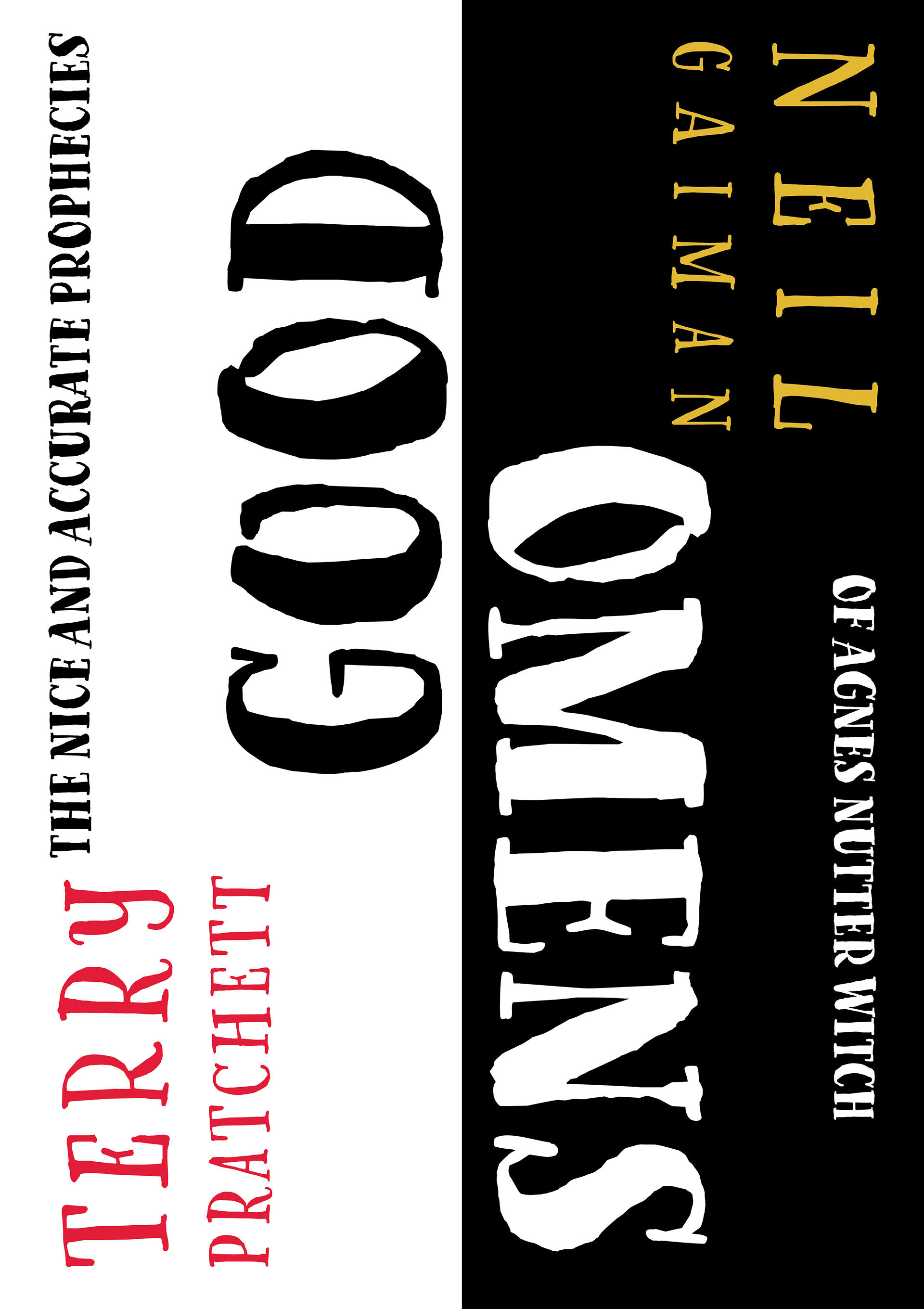
The objective for the project was to create a new cover for an already existing book that I believed needed to be fixed or a book I admired. The purpose of the project was to learn to use typography in an interesting way so that the book jumps off the shelf, as well as develop a sensitivity to typography in paragraph form. I chose a book that was interesting to redesign, as well as one of my favorite books, Good Omens. There were alot of interesting things I could do with typography on the inside and I wanted to stretch my boundaries in that way.
Cover Concepts
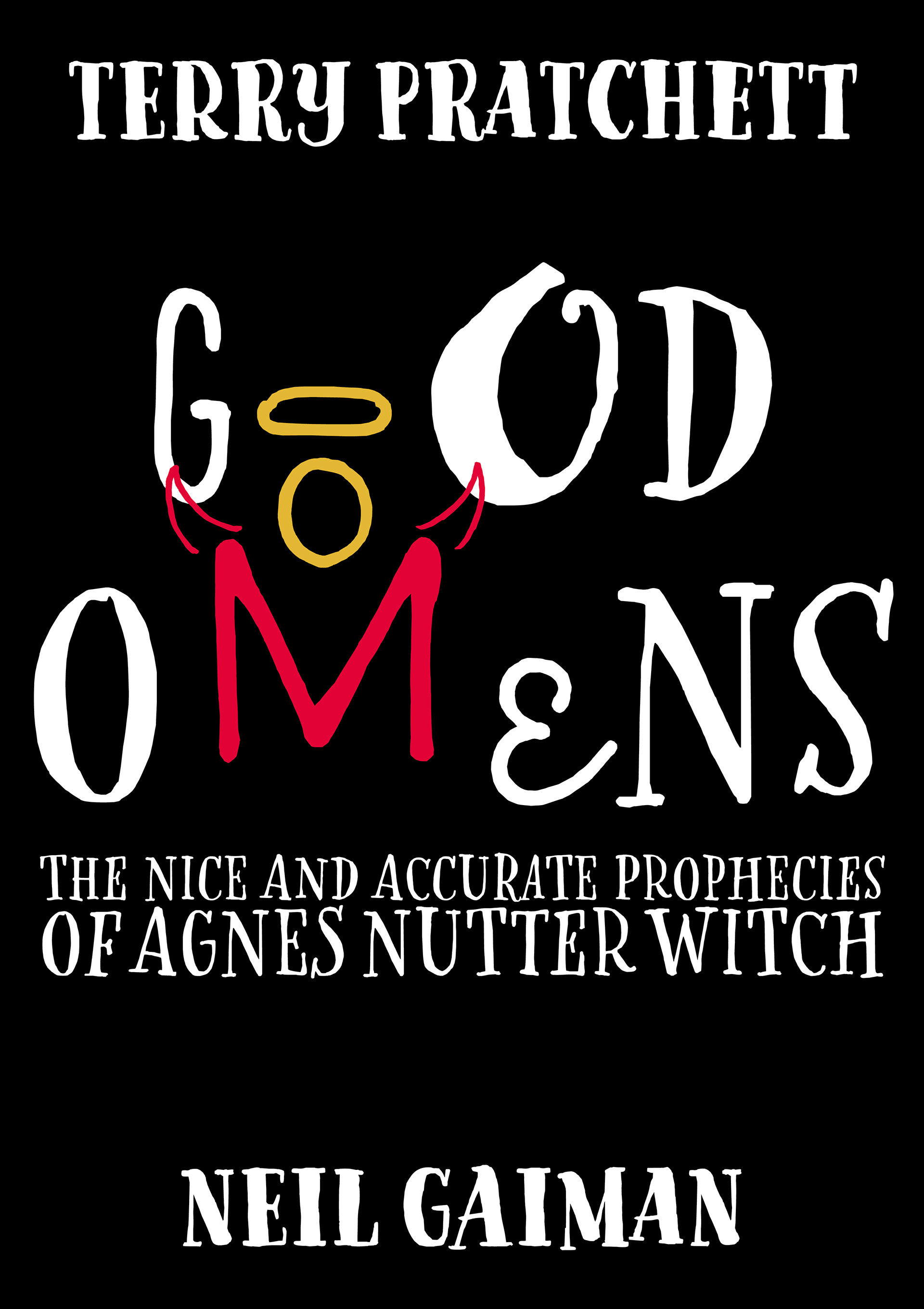
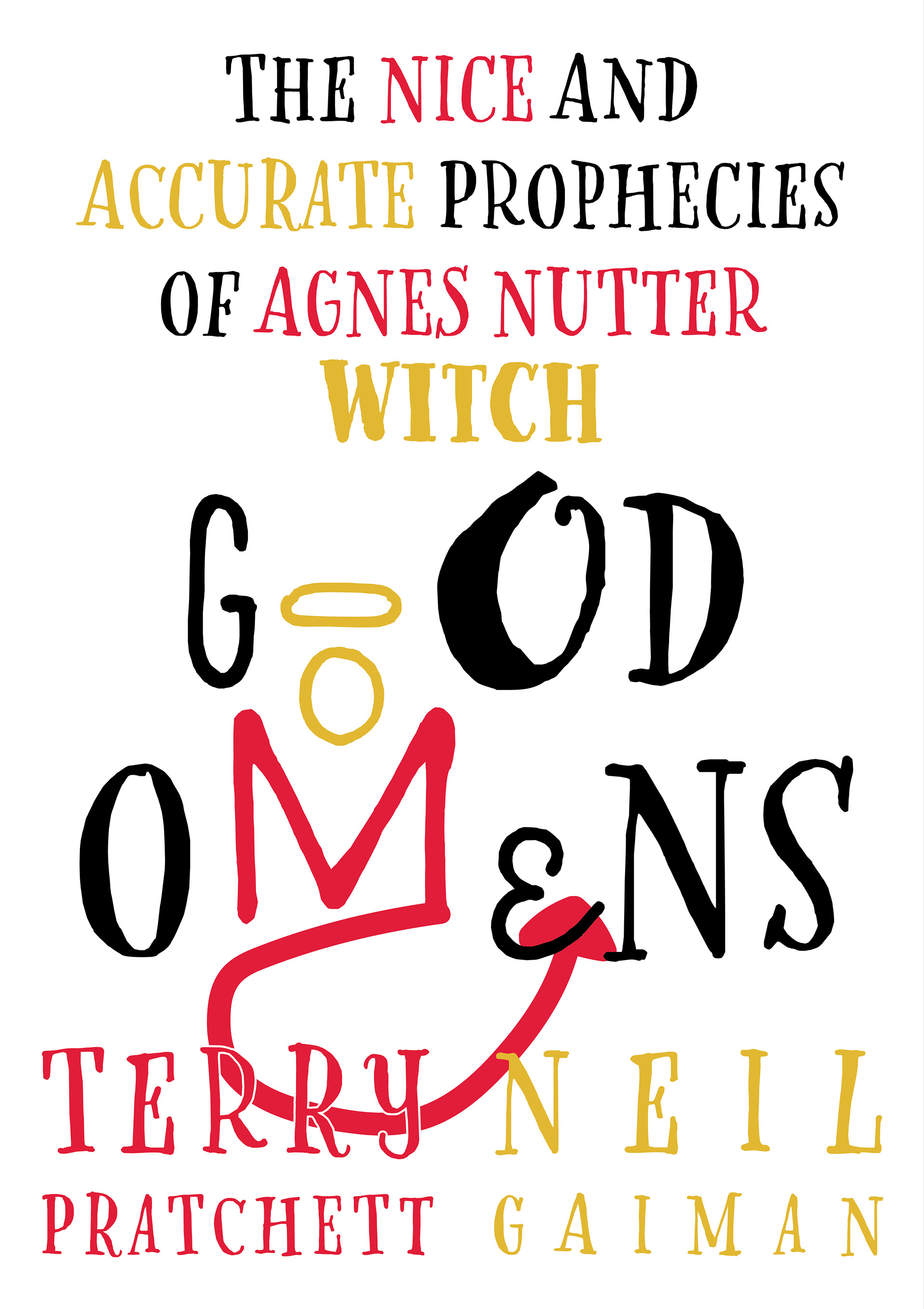
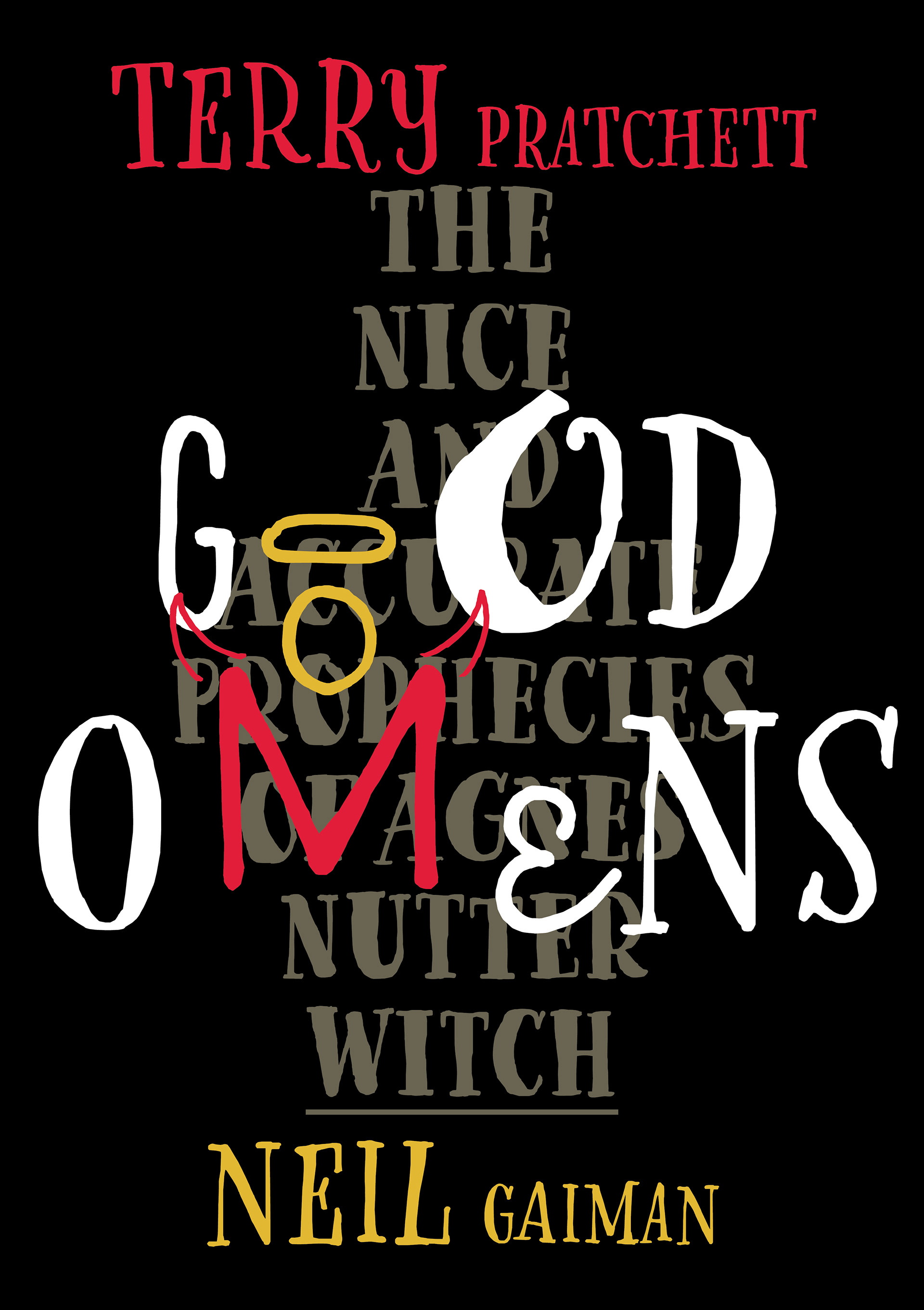


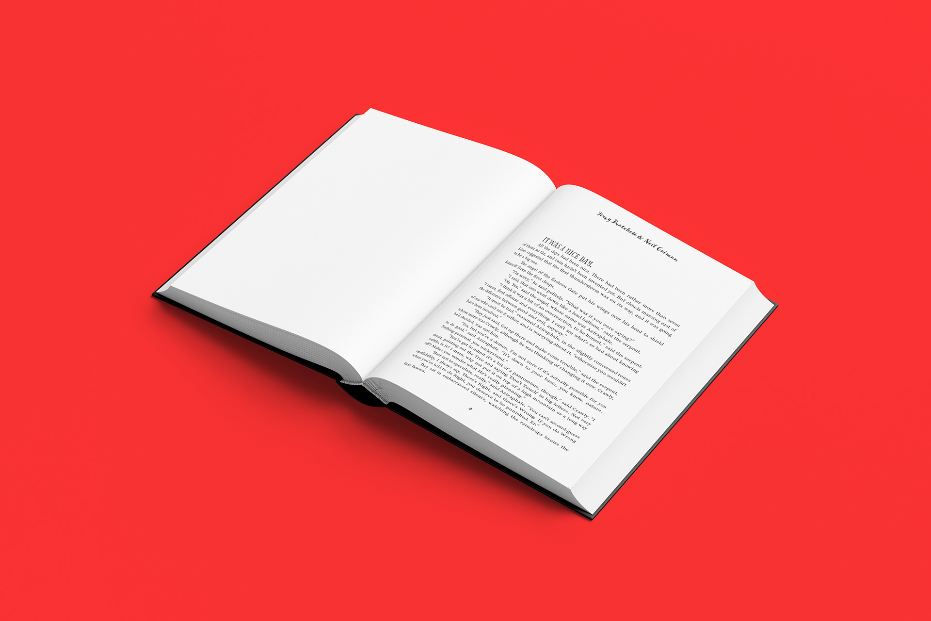
Inside Pages Concepts
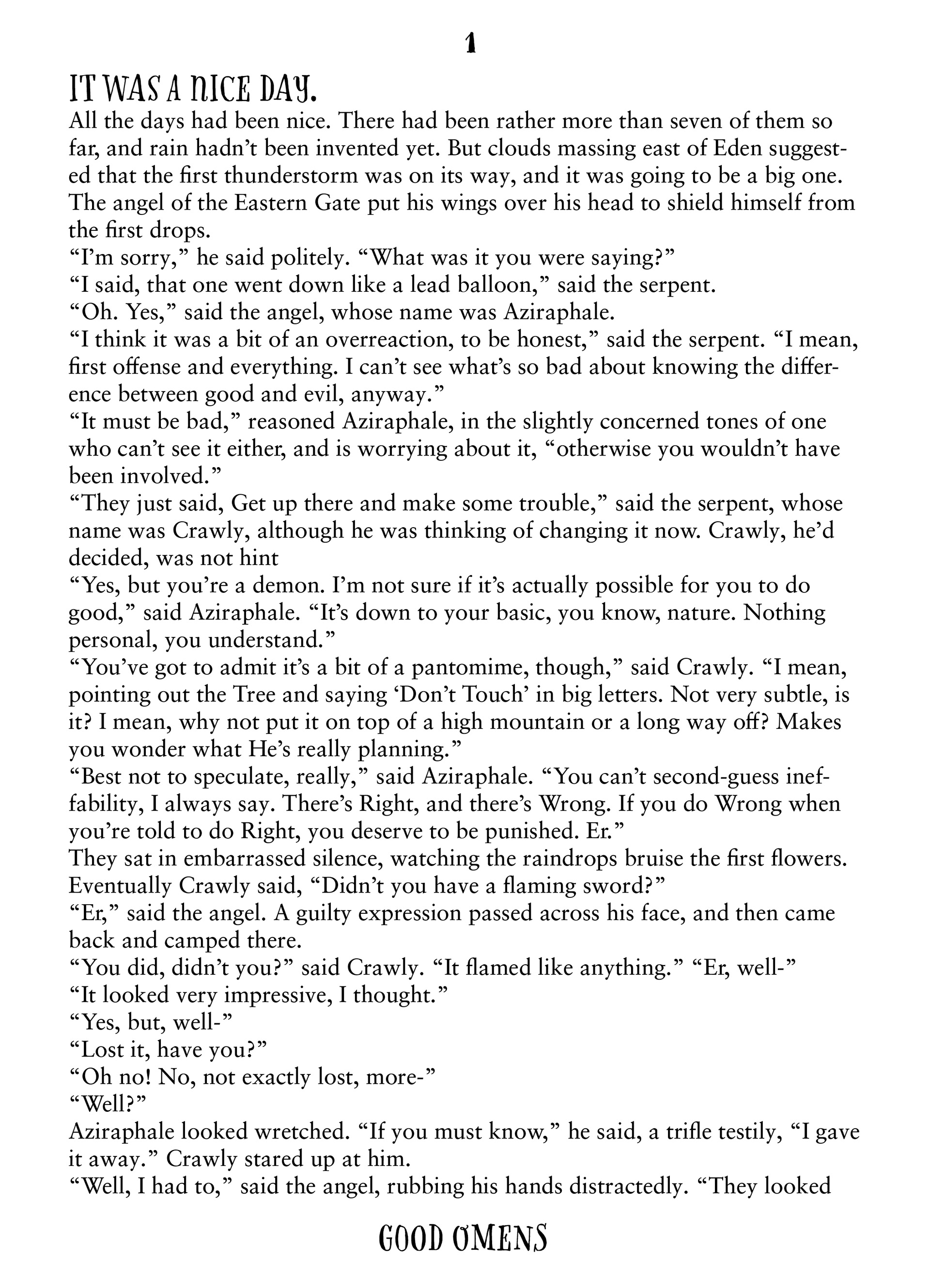
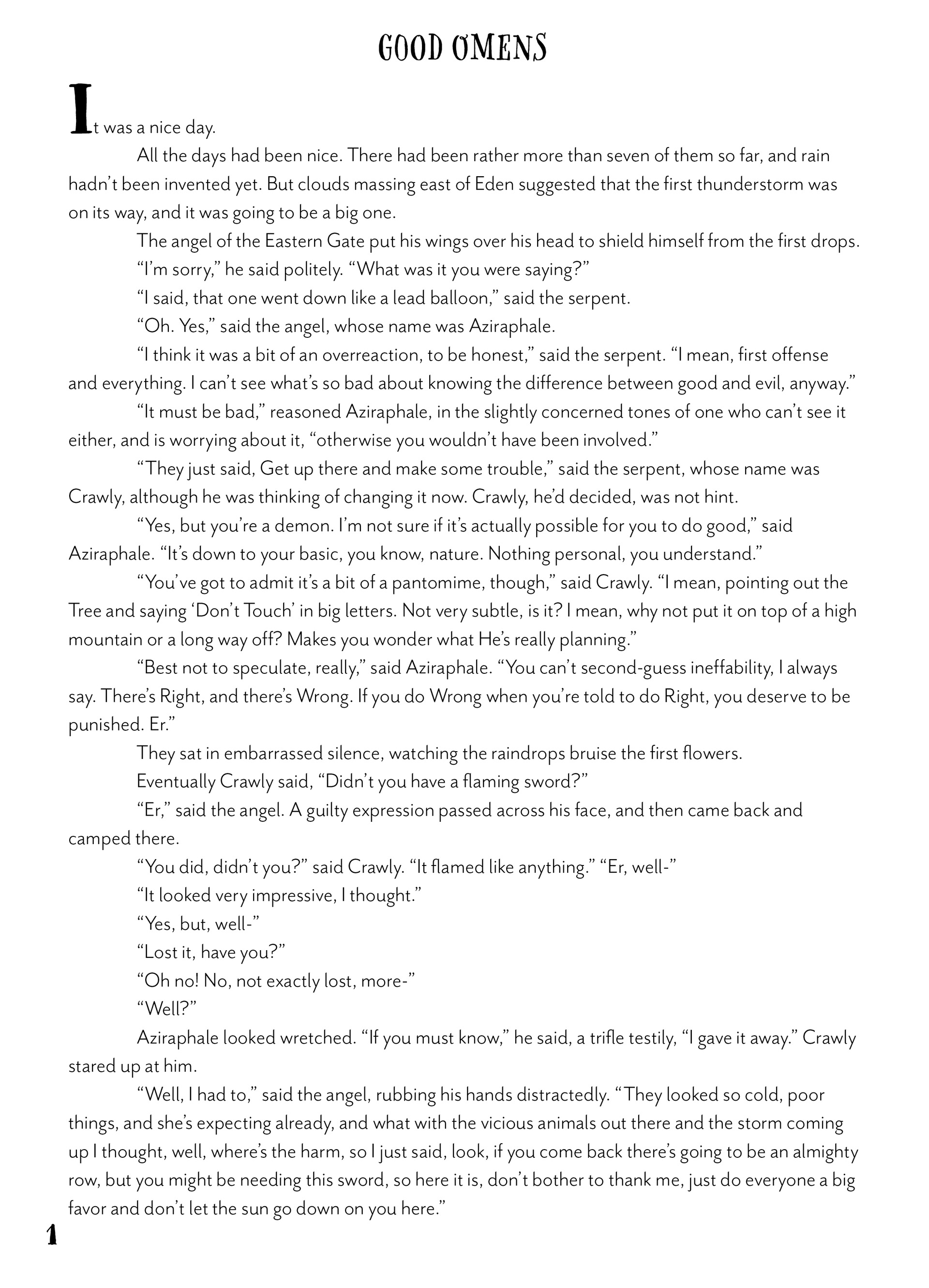
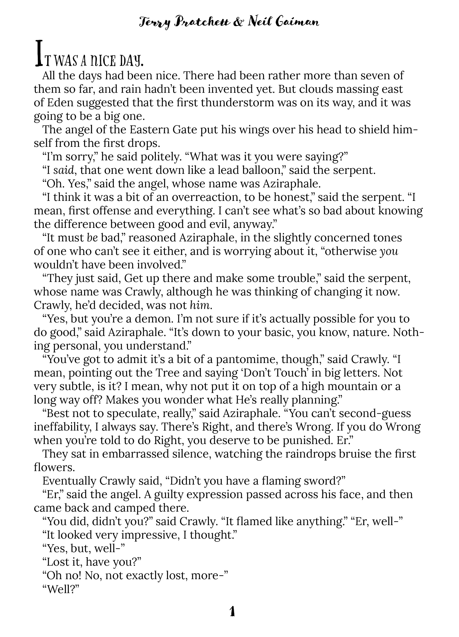
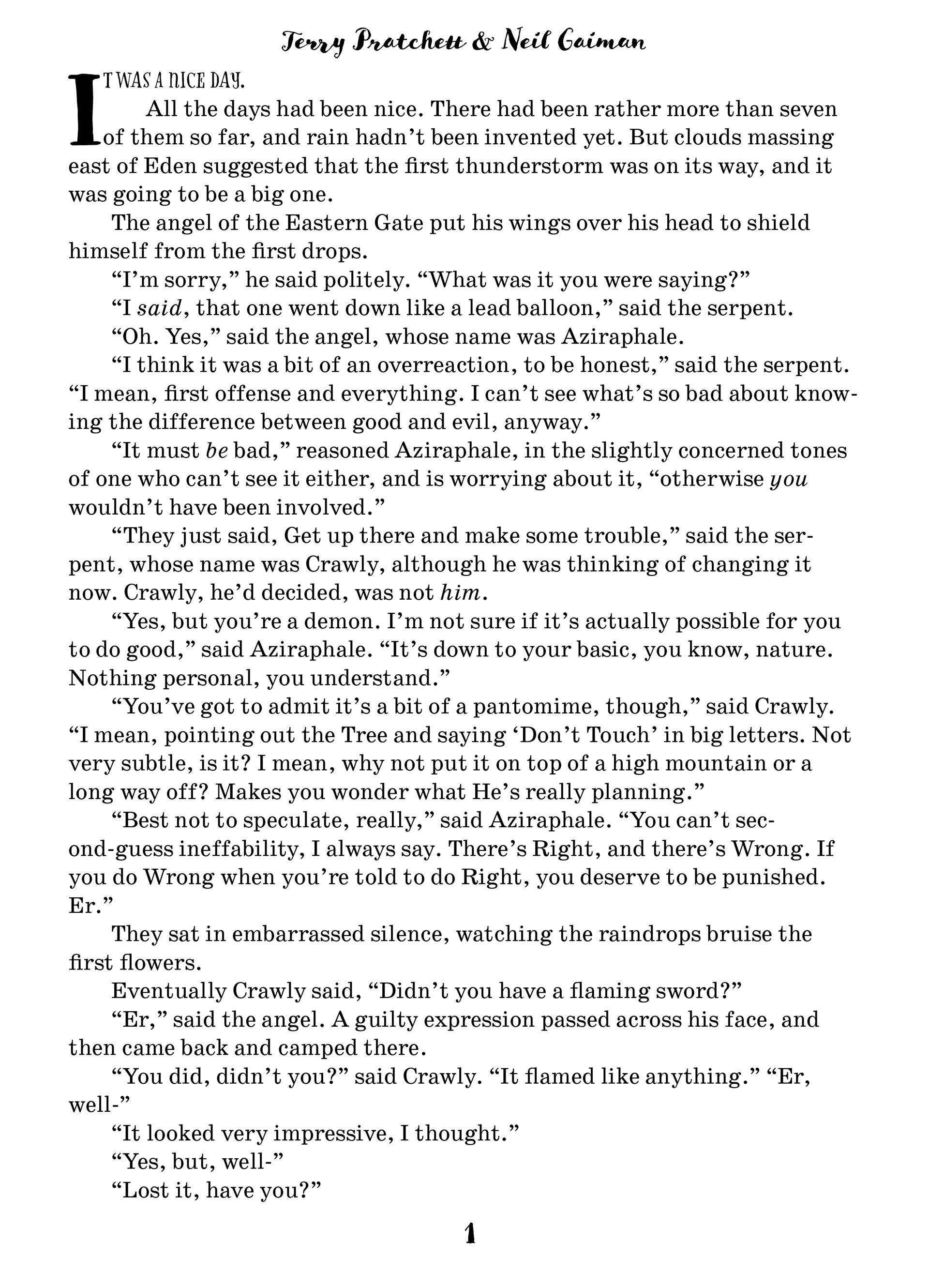
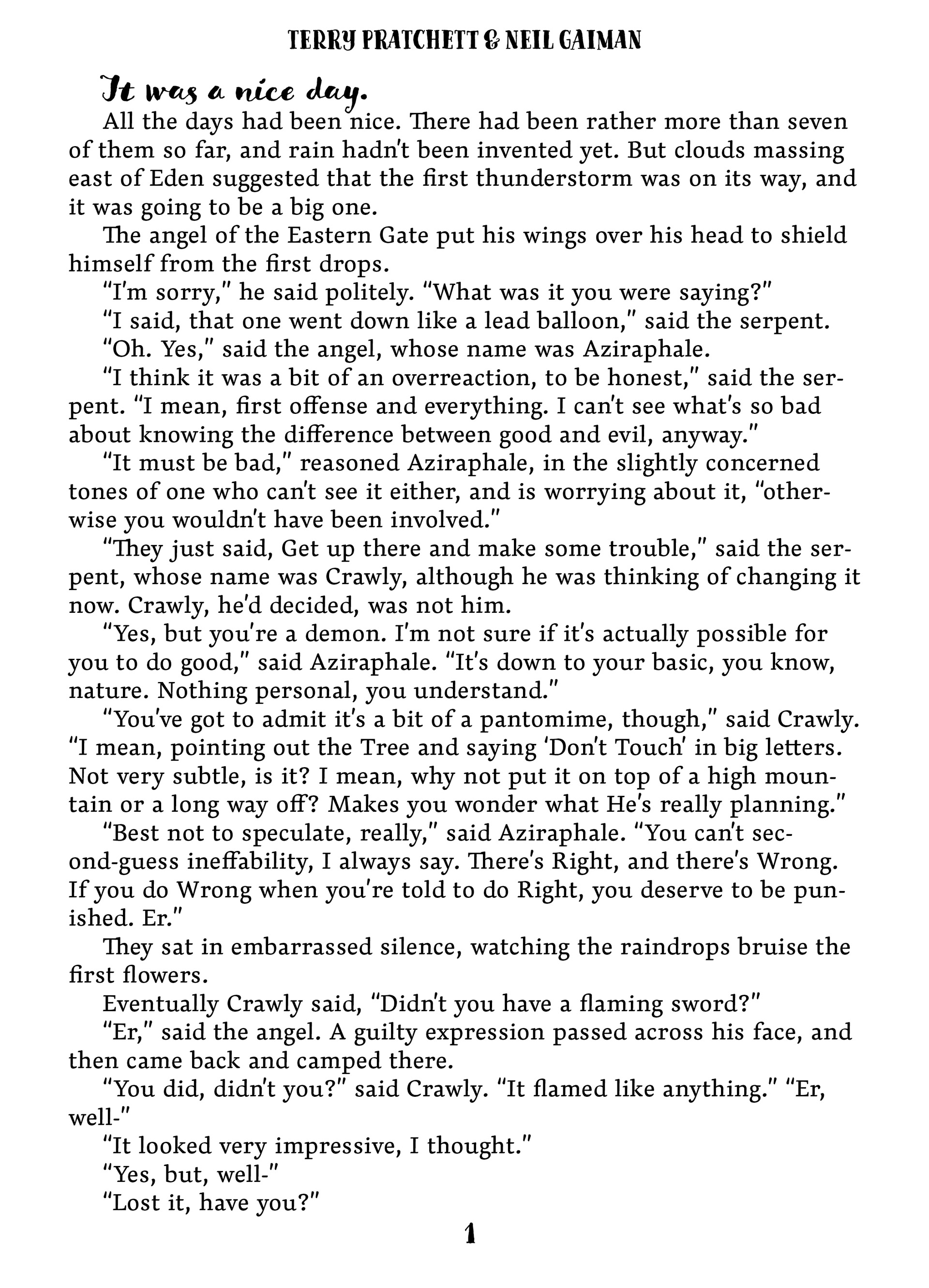
Good Omens is one of my favorite books and I wanted to do it justice. I started out by thinking of the cover. I also wtched the television show that was based off the book so I thought back to that as well. I researched different fonts that look like they would be on a scroll or an older version of the bible for the cover. I also wanted to play with comedy and irony since those are big factors in the story itself. For the inside pages I researched what different fonts were used on the inside of books that have meaning. For example, the first font I used is normally used in romance novels. This was more of an inside joke for fans of the book because the main characters are coded to be in a relationship.
Final Dust Jacket Design
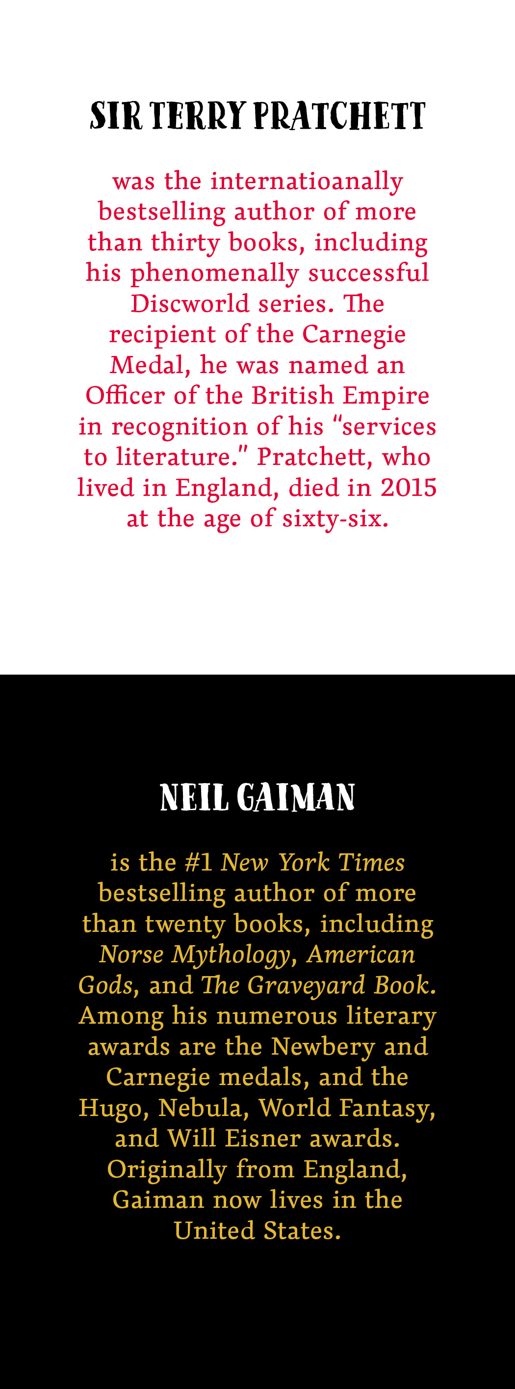
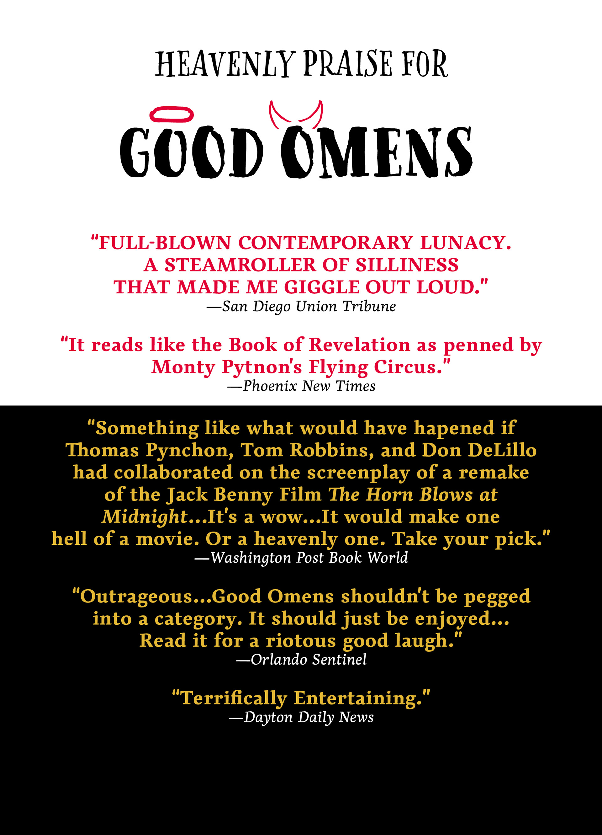

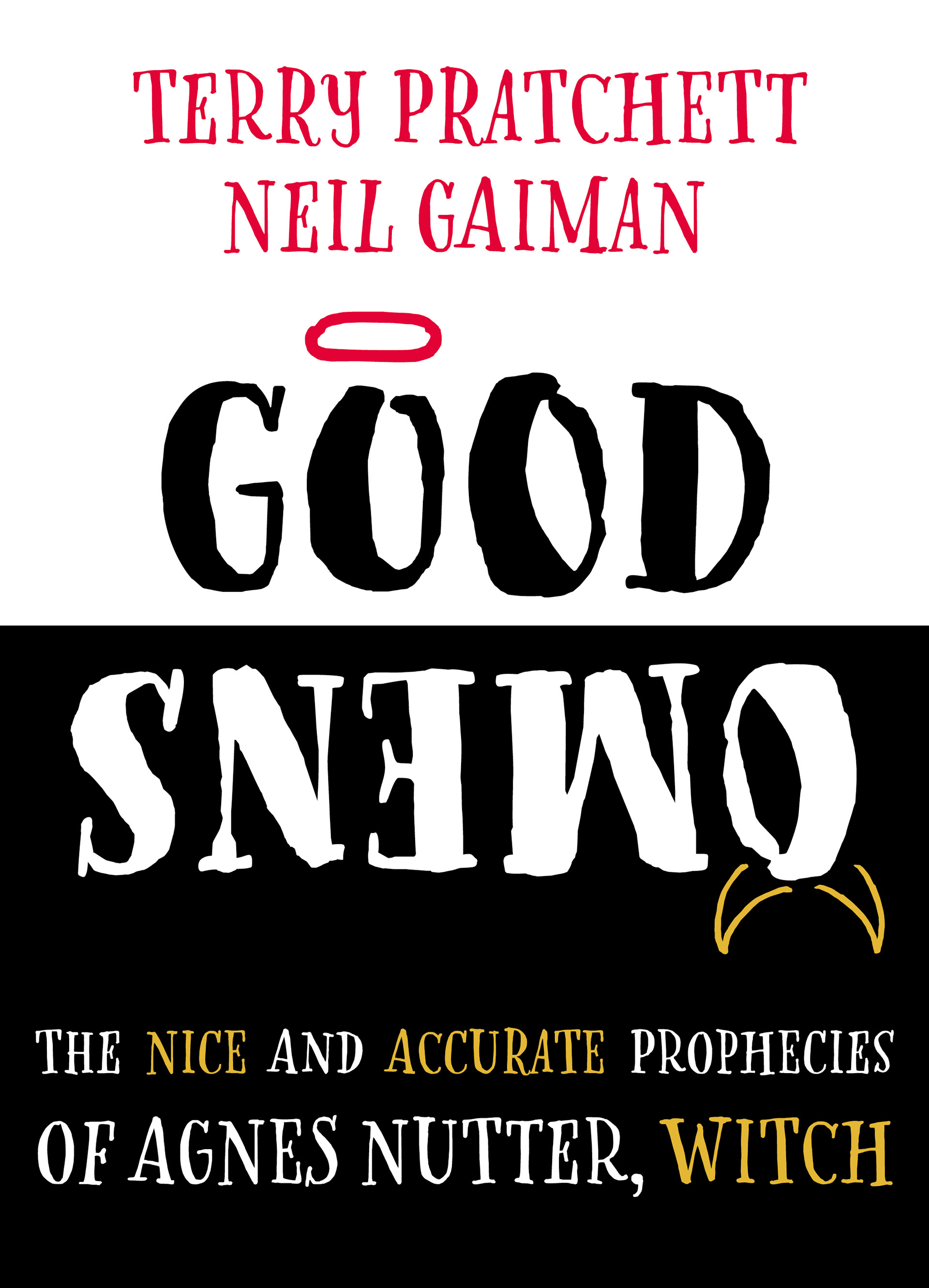
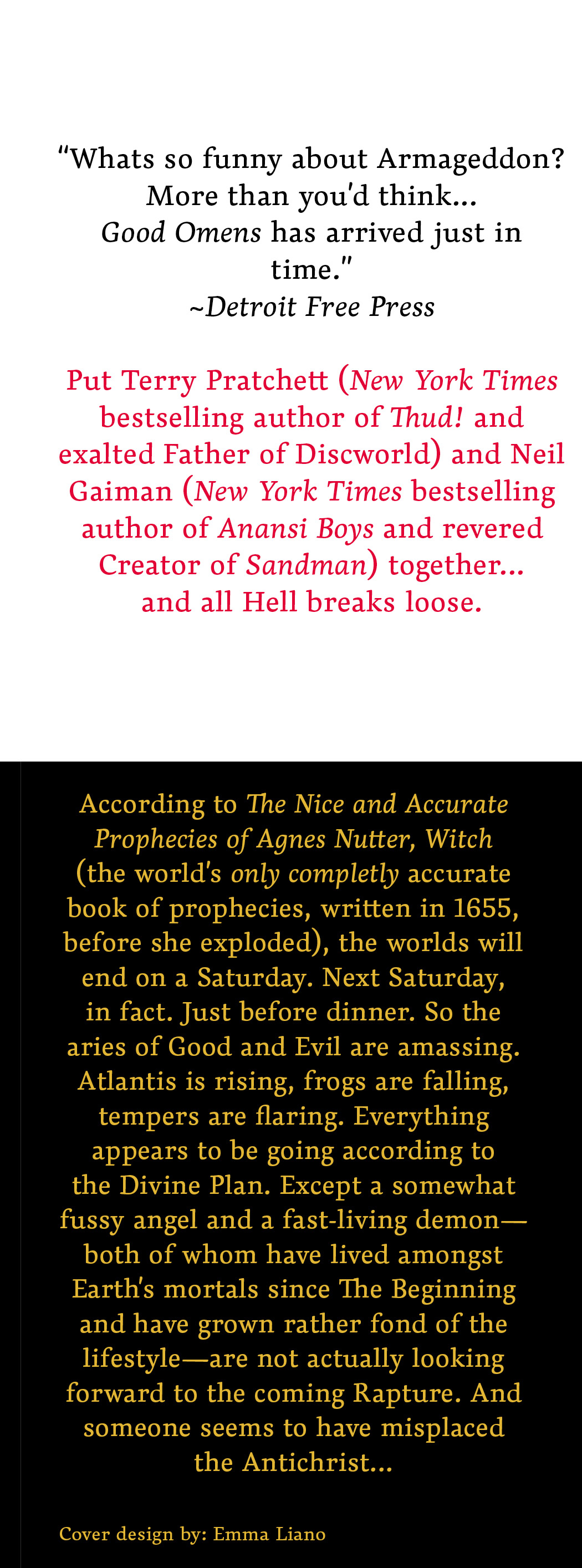
I wanted to keep it simple yet interesting for the cover. I found a font that looked old and a little rough like an old book and used a san-serif for the inside that looked similar but easier to read in denser type. The irony also comes in with the cover as well with the “good” being red and the “bad” being gold.
Inside Pages
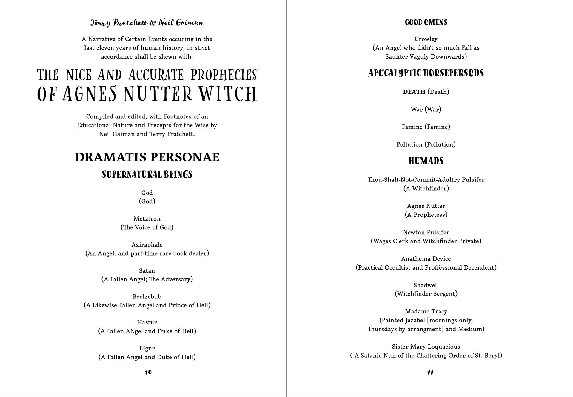
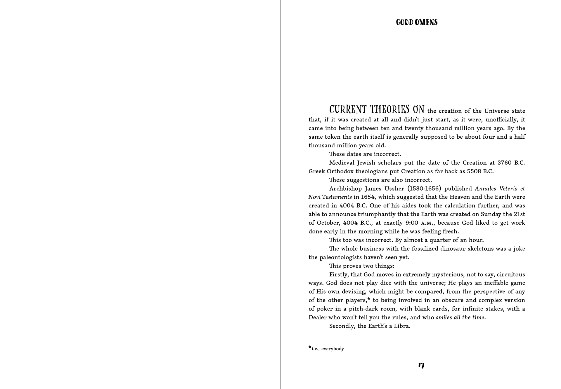
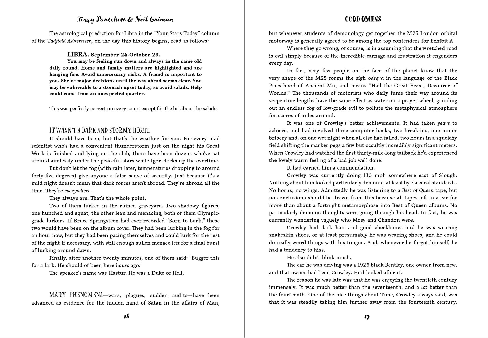
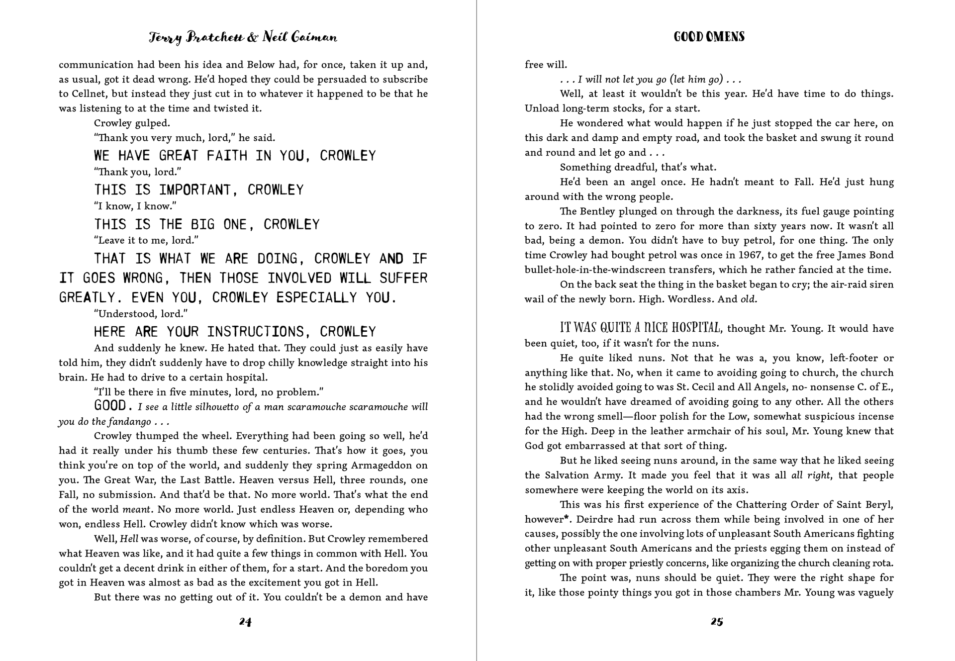
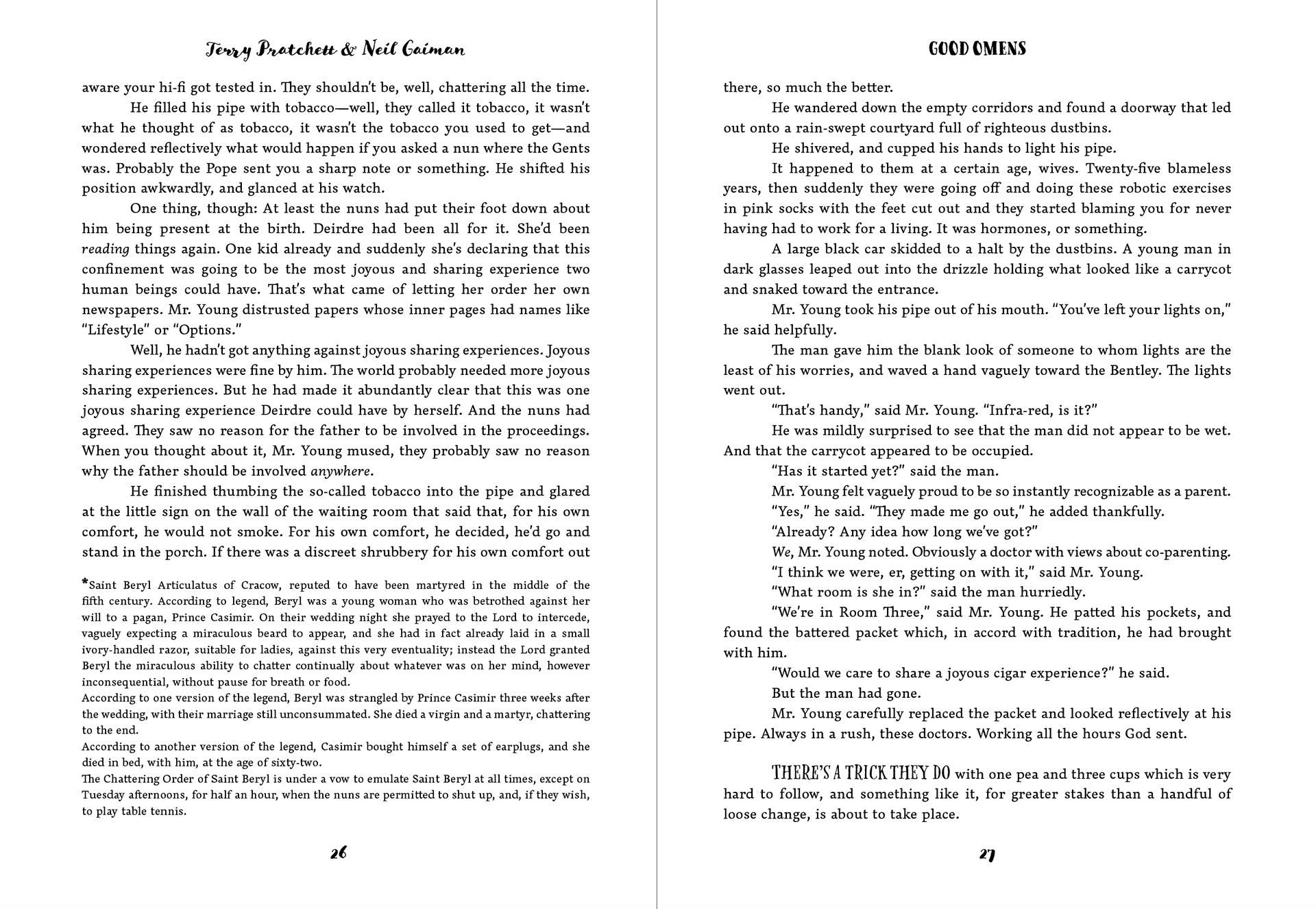
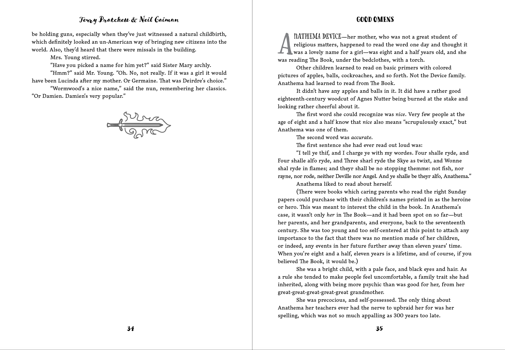
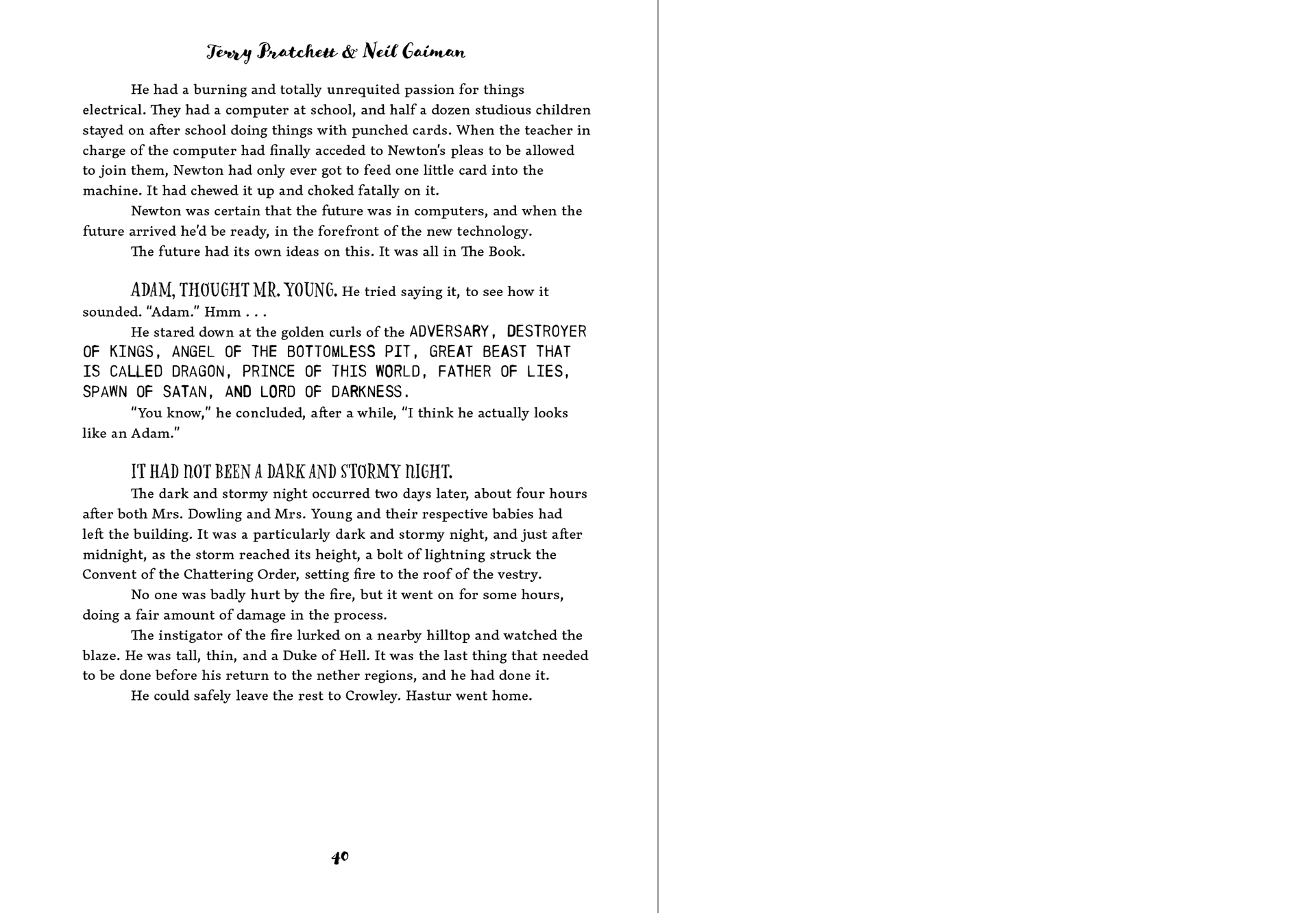
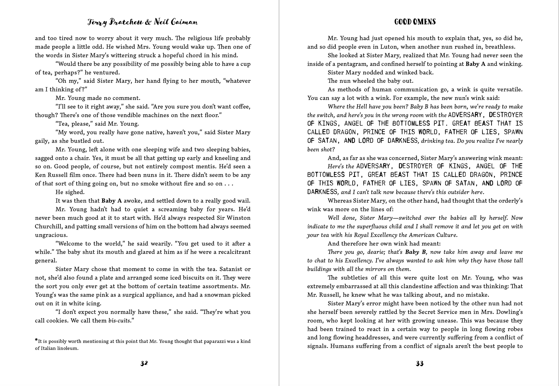
Inside Pages Mockups
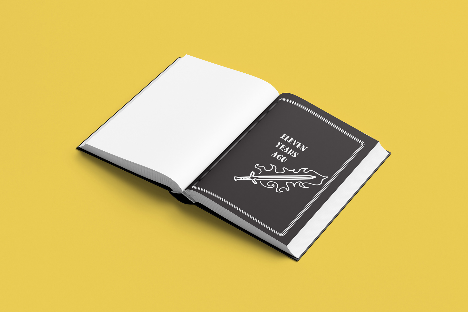
Inside (Chapter Title)
Inside (Beginning of Chapter)
