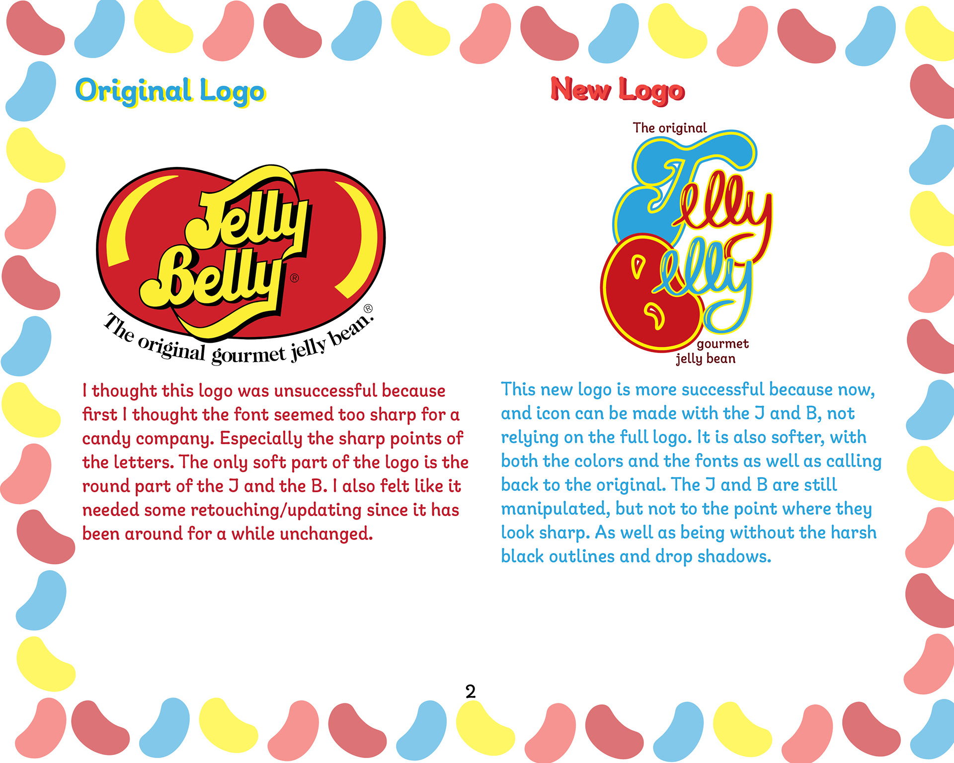

The objective for this project was to re-brand an existing retail establishment that I felt needed to be updated. The choices I chose were Pepperidge Farm, Jelly Belly, and Tiger Mart. After sketching out ideations, I chose to rebrand Jelly Belly since the logo has not changed in many years and I believe it has always look cheap and not like it was representing jelly beans like it could. The colors especially bothered me and really wanted to focus on color pallet.
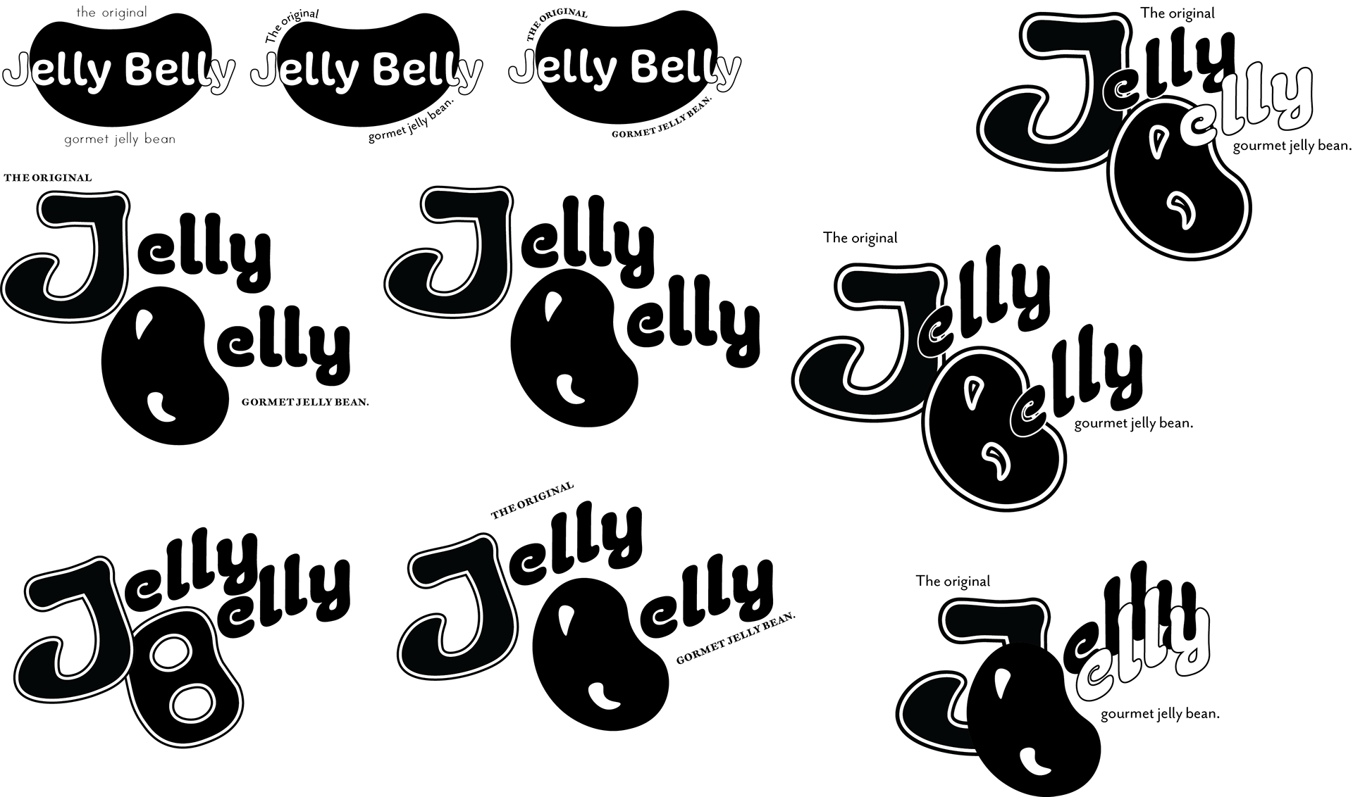

Jelly Belly Logo Concepts (Black and White and Color)
It was very difficult to get a logo that stayed on brand to the original Jelly Belly, since re-branding the company would feel like a step backwards. So I decided to just do an update to the logo instead of a total re-brand. I stuck with the idea of making the “B” a jelly bean. This would be in place of putting it behind the words of the logo.
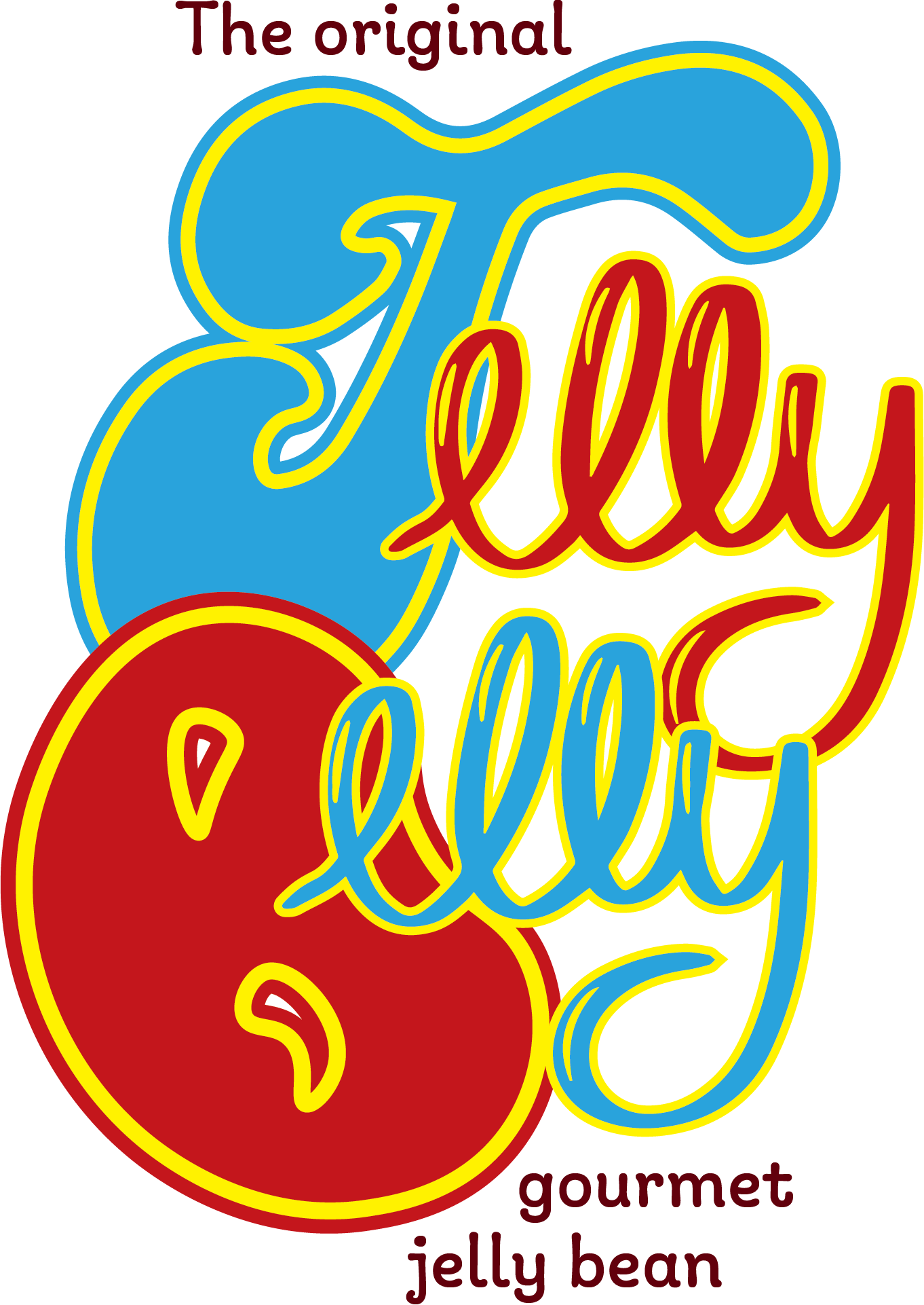
After I started to add color, it did not look right with the colors I chose, so I went back to the drawing board. After some thought and discussion, I chose to go towards the hand lettering route. I drew the “J” and the two “elly’s” myself and created them as vector in illustrator.
Final Logo
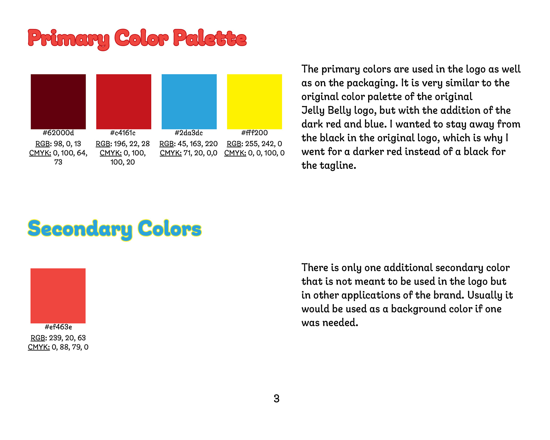
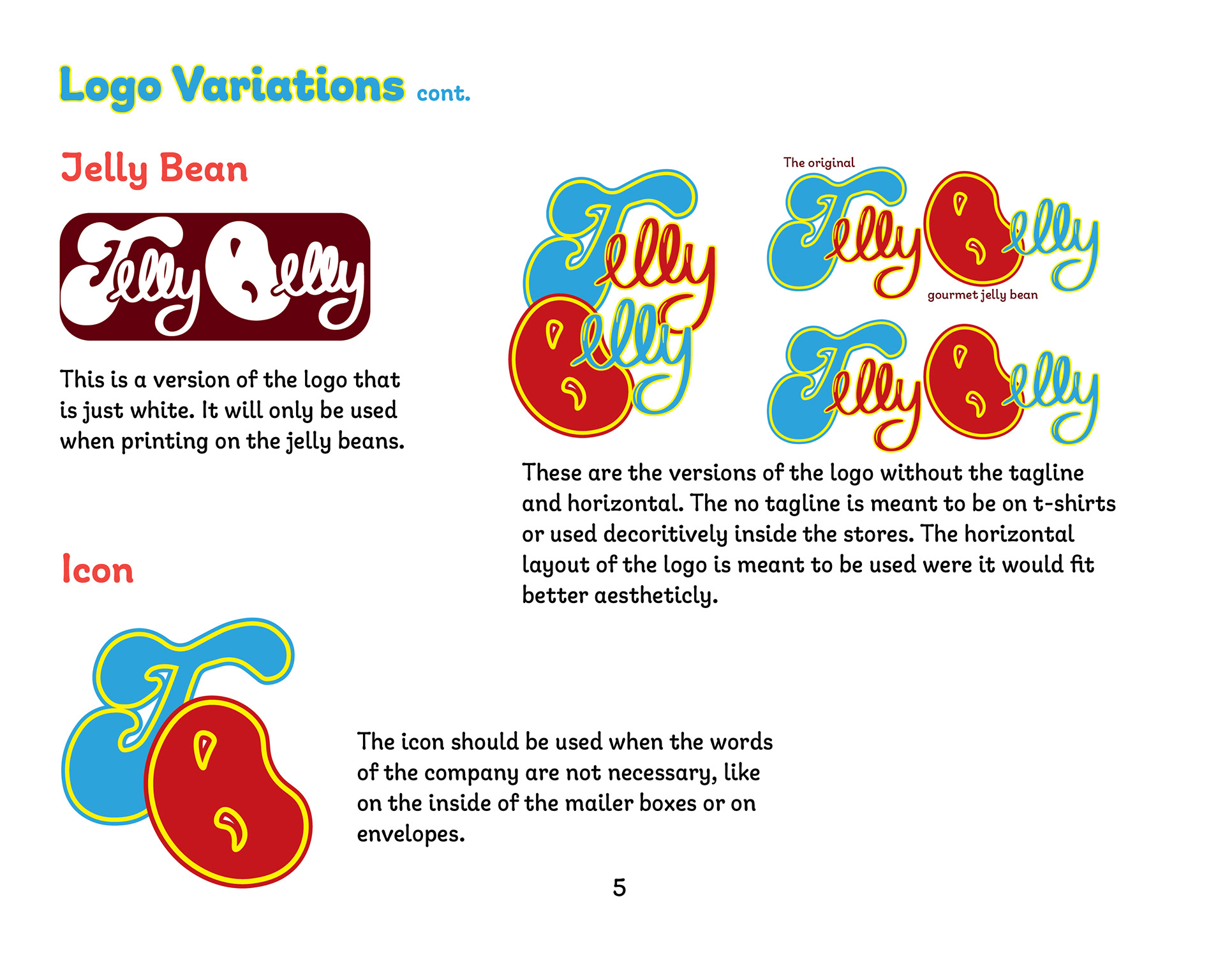
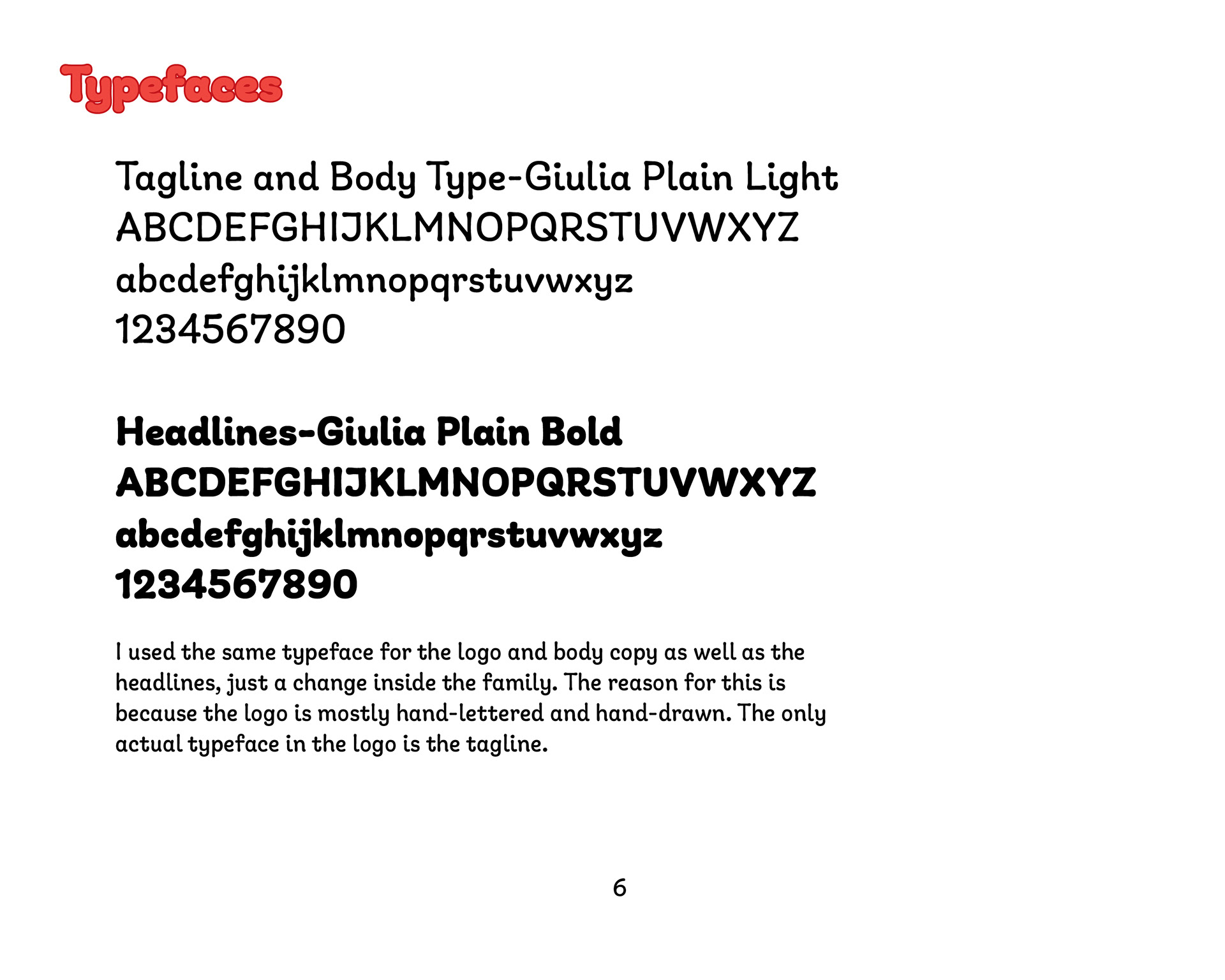
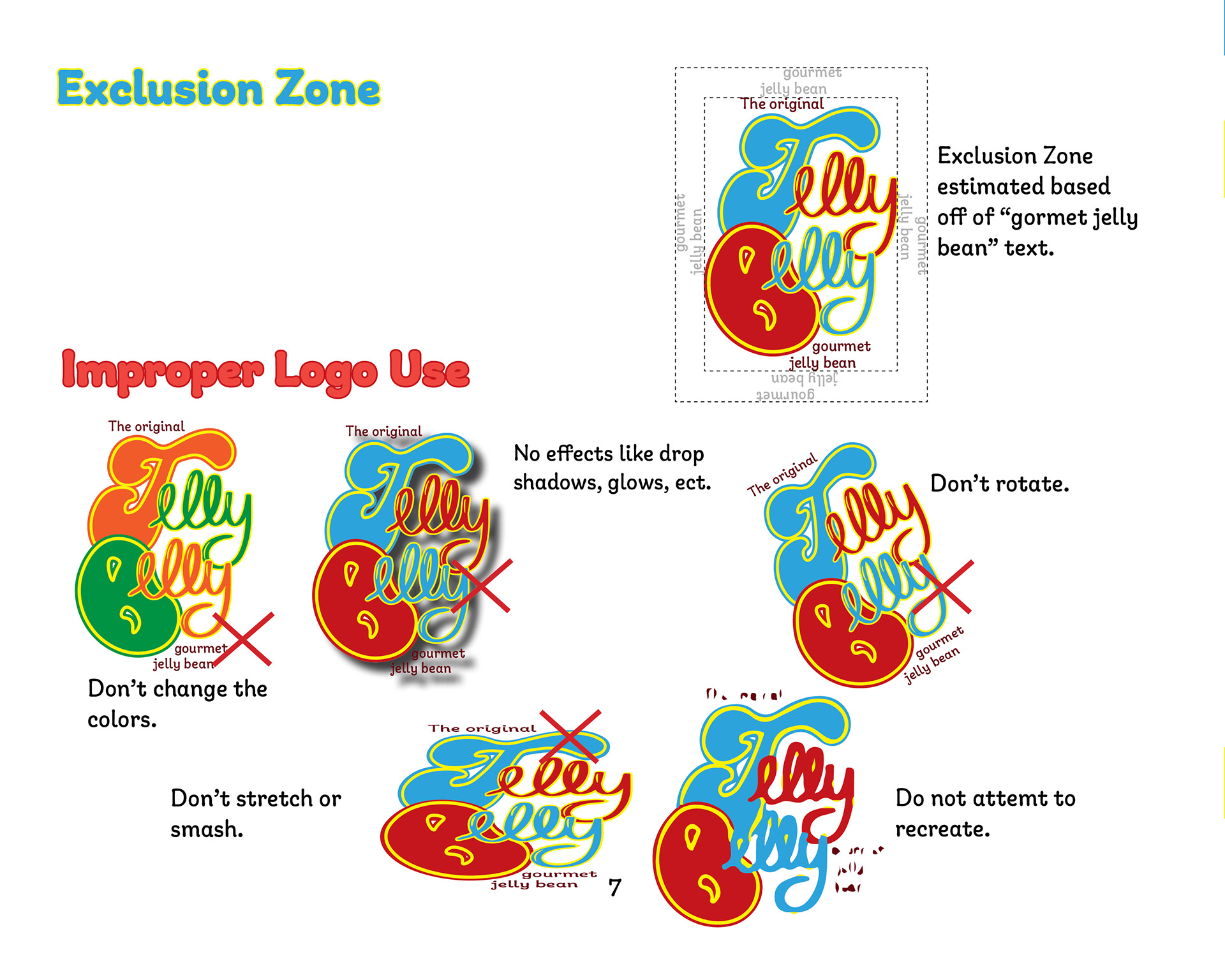
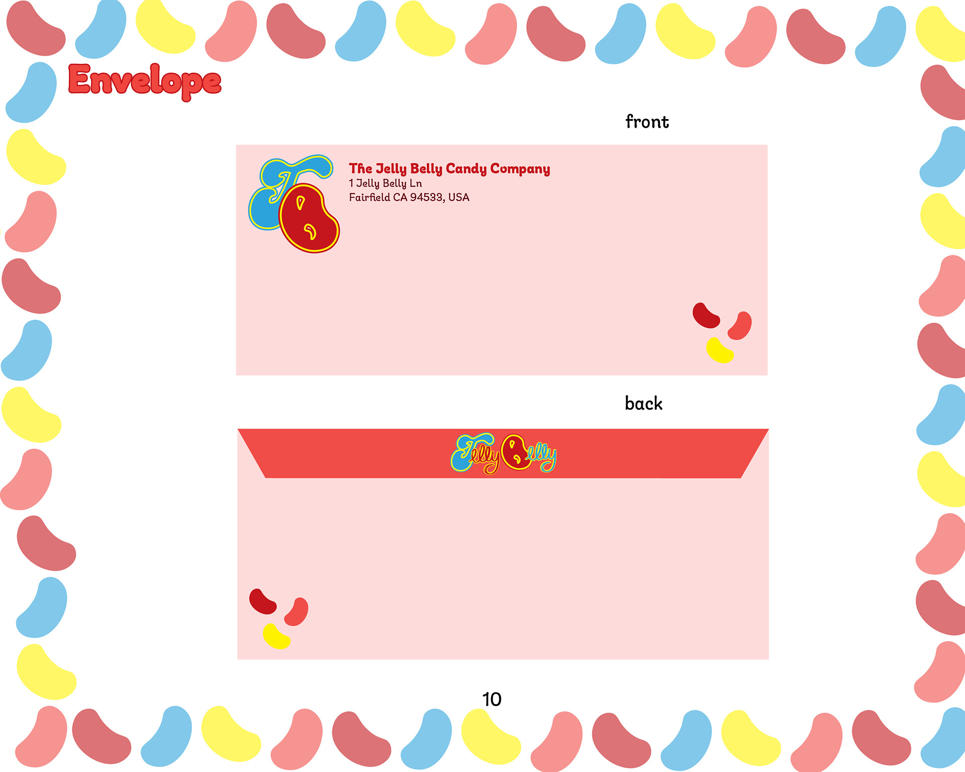
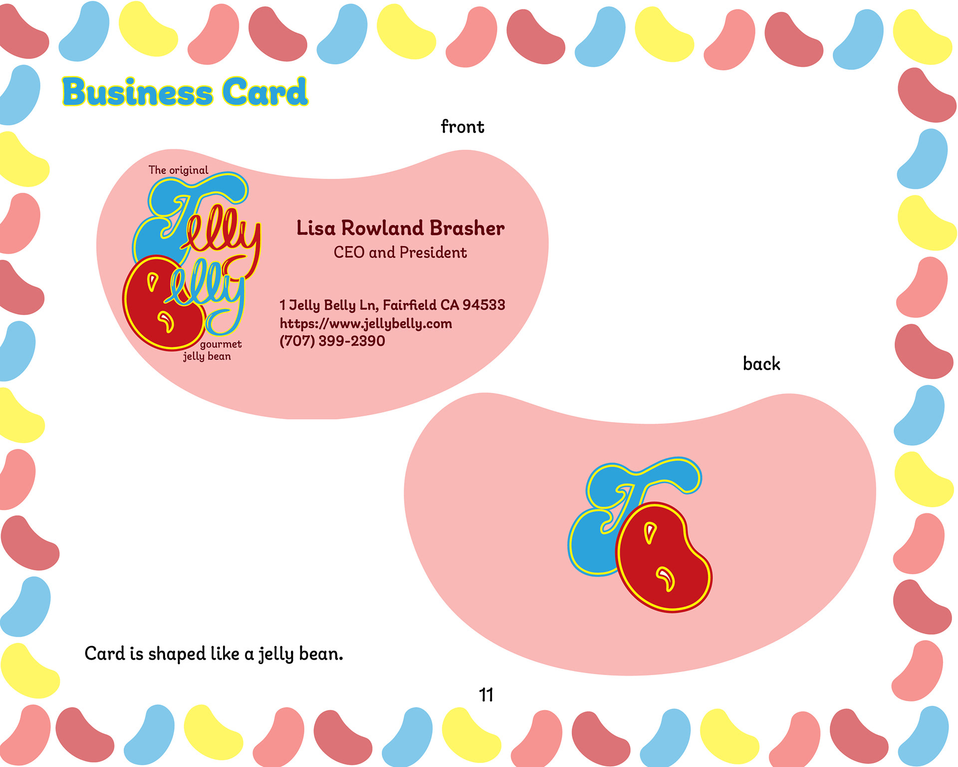
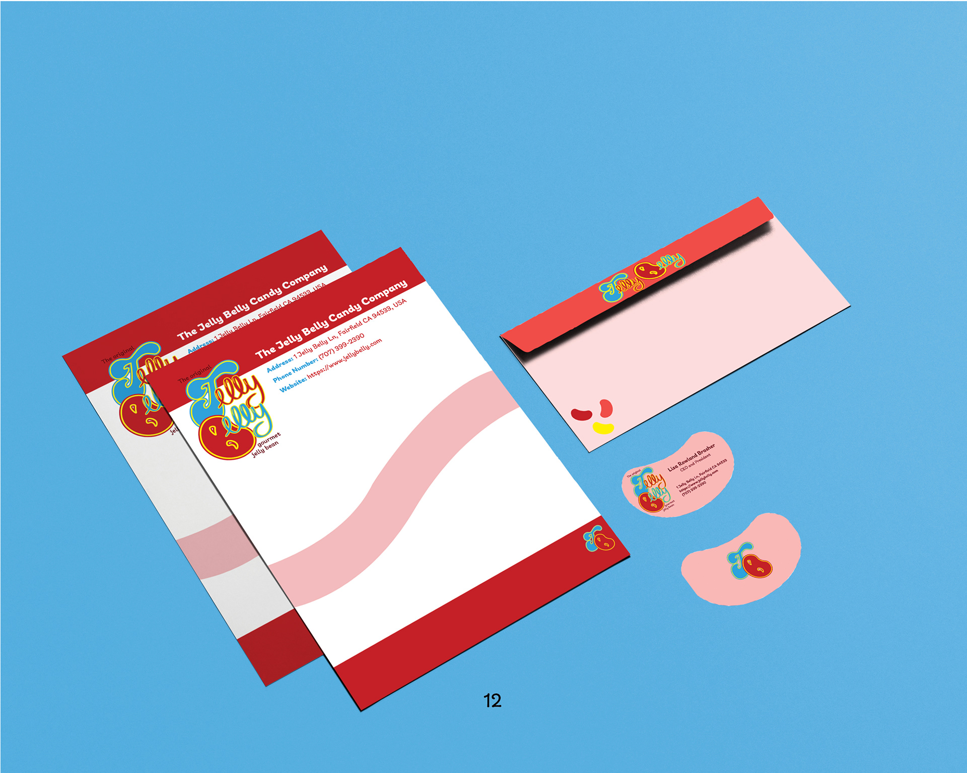
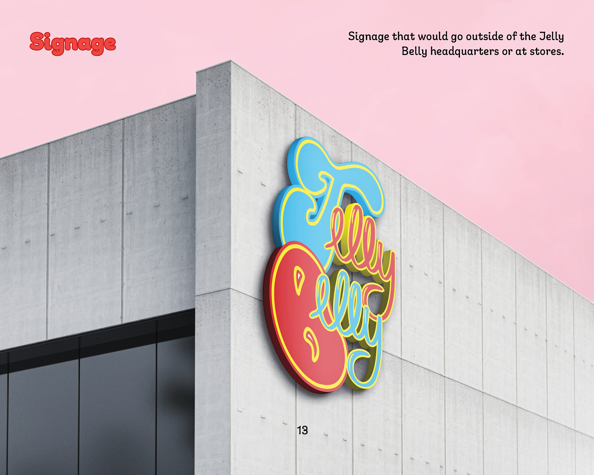
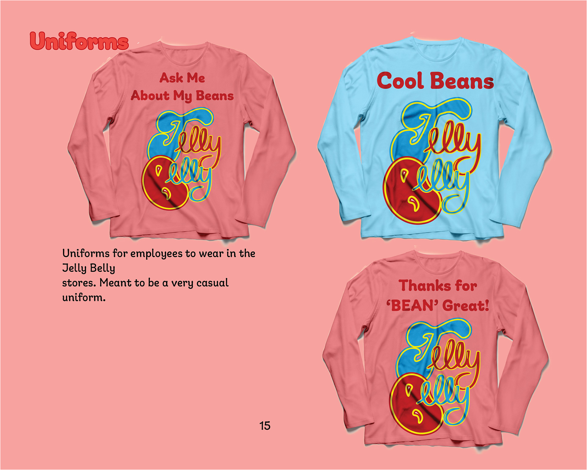
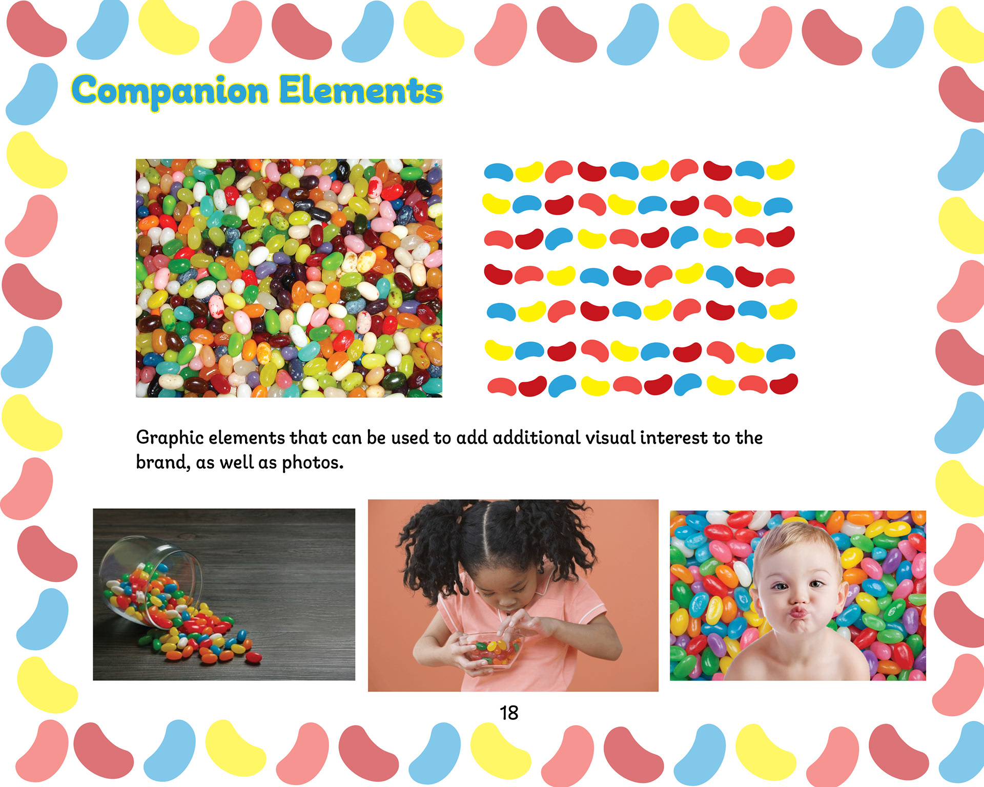
Also for this project, I had to create a styleguide for the new brand. Complete with mockups, typefaces, and different ways to use the logo.
Style Guide