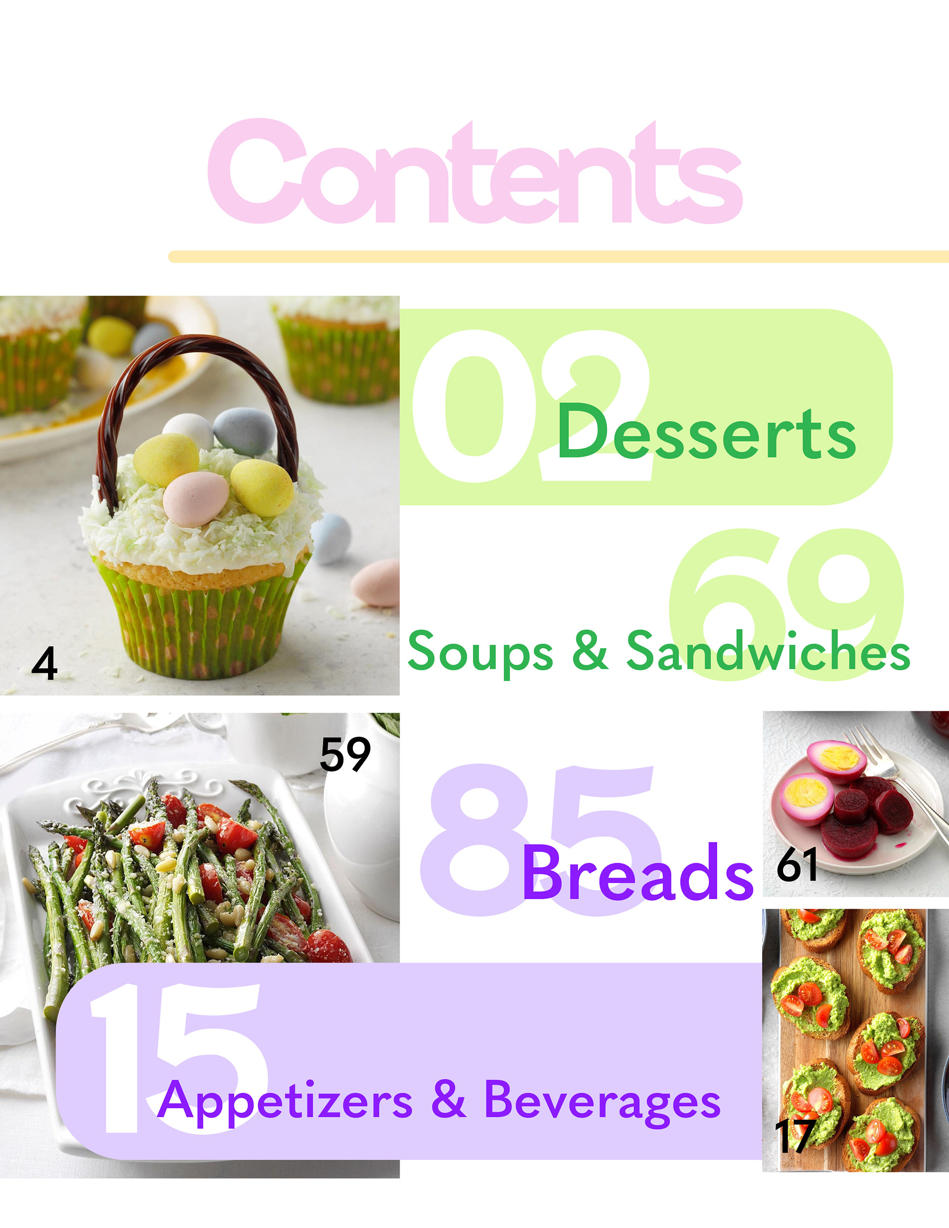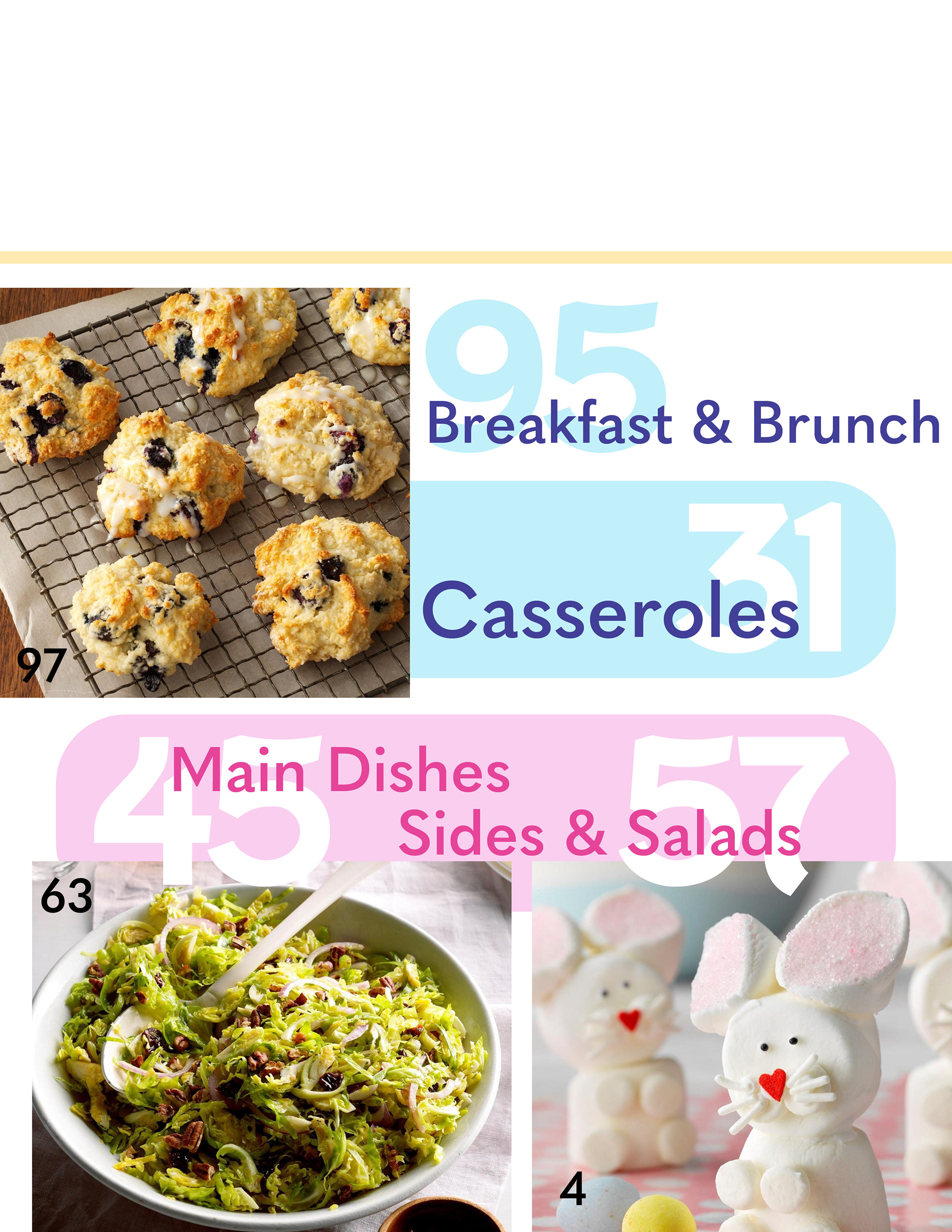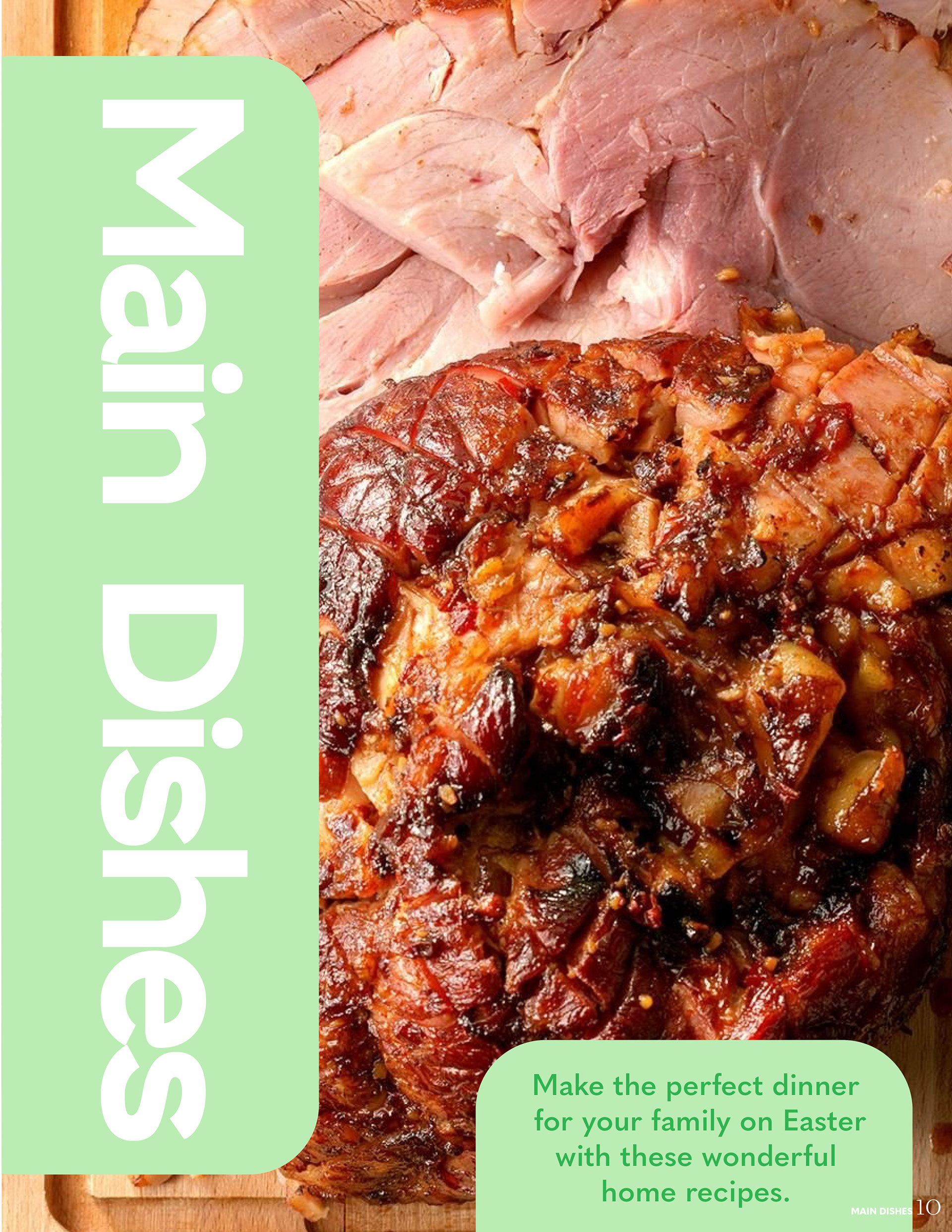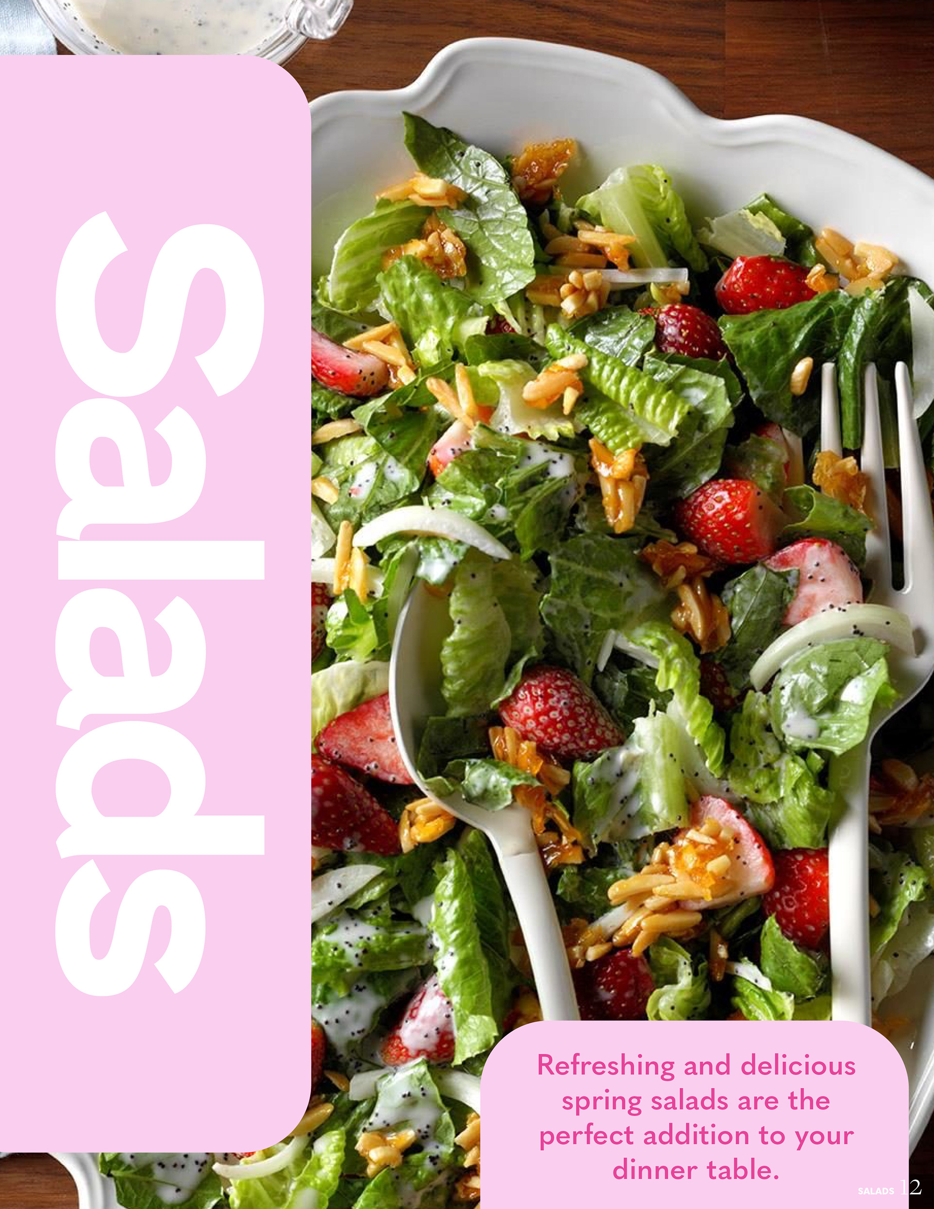

For this project I was tasked to create a spread for a major publication. I chose to modify the Taste of Home publication, specifically for the spring issue.
The new publication I created has improvments such as the logo has changed. The colors of the letters in “Home” would change with each issue. In this specific issue, the colors are pastel colors to match with Easter. So, for example for a fall issue they would be yellows and oranges. Also making it more interactive with itself, having it overlap in some places. There would be recipes and individual recipe cards to cut out and keep instead of lots of advertisements and distracting articles in between.
Spreads